

Email Marketing is still a notable method of digital marketing. Despite the involvement of new technologies and tools like Chatbots and conversational marketing concepts. 93% of B2B marketers still prefer Email Marketing to distribute their content. Email Marketing had never been so popular without the use of CTAs(call to action). Email Marketing CTA is the most important component that encourages readers to act.
What Is Call To Action [CTA]?
A call to action or CTA is a button or hyperlink text designed and placed with the content. The motive behind the placement of CTA is to compel the reader to take the desired action and click on the CTA. It directs the reader to convert by navigating the reader to the desired page.
CTAs are an important element to establish interactivity between the brand and the customers/users/readers. But, what do you think of working with CTAs? Is it as easy as it seems? Can it be implemented in your Email Marketing campaign with a 100% return rate?
Well, there are many things to consider before planning the email marketing CTA, it’s design, color, placement, and everything. One of our team fellows came across unique observations to design and place CTAs. These observations have shown us the results and benefited our marketing goals. We’ll be discussing the same sooner. But, for now, let’s proceed with the best practices that the top email marketers are following.
Best Practices To Effectively Use Email Marketing CTAs
1. Follow The AIDA Model
The AIDA Model intakes the 4 parameters that when performed together generate results. The 4 parameters of the AIDA Model are:
- Attention
- Interest
- Desire
- Action
These 4 parameters are equally viable for the CTAs as for product marketing. AIDA Model must be considered while designing the CTA. The last parameter,i.e., Action is actually the stage where the users’ are all informed and motivated to take action. The above three parameters in the case of CTA are the real supporters for the “Action” to implement.
Your Email CTA text should be optimized to make your reader attentive to the topic you’re discussing and can generate the interest and desire to actually take an action. AIDA model defines the customer’s journey. Hence, it is keenly followed by marketers.
2. Check The Big Four
The Big Four are the key components of a successful CTA. They are –
-
1. Design
The color, size, height, width, shape, etc. All matters while designing the CTA. There is no ideal layout for the CTA design. It completely depends on the email marketer. They very well know their audience’s behavior and understands what they prefer to see and how?
While designing the Email Marketing CTA, you must consider the following points –
- The button color of your CTA must resemble your brand
- The size of CTA should not cover the whole screen space, neither it should leave the available space and occupy only little corner space. Your Email marketing CTA size should be optimized to the available screen space for the emails
- The width & height of the CTA should be decided depending upon the content type and position of the CTA
- Design different CTAs for desktop and mobile email versions
- Use the whitespaces efficiently to place the CTA. Whitespace along the circumference highlights the CTA.
-
2. Message
The CTAs instigate your readers to click and take action. And, so it gets immensely important to curate action-oriented text for CTAs. You must know the process/workflow before you draft the message. Also, CTAs are compact and short. Having long messages won’t fit in your CTA button text.
Neither having hyperlink CTA with long text looks good. As per the experts, the CTA button text should be 2-4 words and targeting to the objective. For example, “Shop Now”, “Book Your Trip Now”, “Claim Offer”, etc. are short and targeting action words. Also, these kinds of CTAs create a sense of curiosity and urgency among readers.
-
3. Placement
Your CTA placement takes accountability for the success and failure of the CTA. Don’t crowd your content with multiple CTAs. The placement of the CTA should be strategic to the purpose they’re being placed for. While placing CTAs in emails, you must consider the contents’ nature. If your CTA doesn’t require any monetary or heavy commitment then you may feel free to place it in the first fold of your email.
But, in another case, where your CTA needs any solid commitment, your reader will be willing to read the details before taking any action. And, so you can place the CTA at the bottom of the text. Hence, you must consider the purpose of having a CTA while deciding on the position.
-
4. Testing
The design, message, and placement position are all fine as per you. But, what about the actual performance and real-time data? Hence, to be double sure with your CTA, you can perform A/B Testing. You can compare your final CTA’s performance with other CTA and observe the real-time data and performance of each CTA before implementing them in your email marketing campaign.
3. Target Your Niche
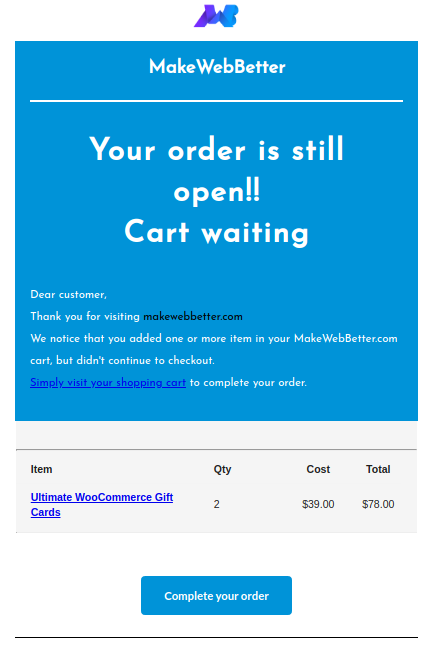
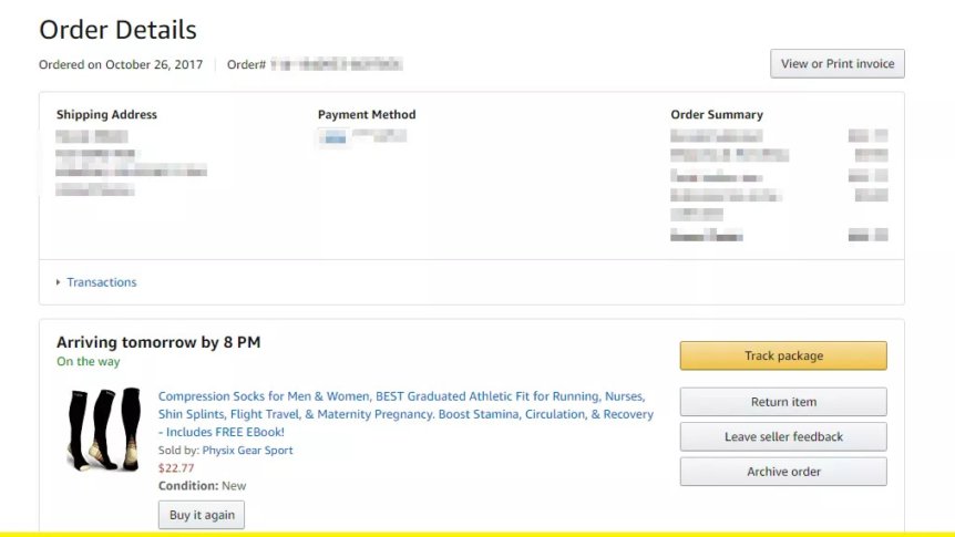
Surely, your mail content is specific to your niche and so should be your CTA. If you have an eCommerce store and you wish to send mail to your customers for upcoming offers, you must instigate your readers to grab the offer. And for that, your CTA content should be compelling enough to Act. For example, if you look at Amazon’s order confirmation mail, you’ll be amazed to see how clearly they have placed their multiple CTAs in a single email.
4. Have Platform Friendly CTA
Every user has a different experience of the same website on different browsers. This is because each browser renders the same website differently. Hence, the CTAs experience also differs on different browsers. Therefore, you must be sure of your email marketing CTAs’ experience in different browsers and also on different versions of the same browser. You may test the user experience of your CTA on different platforms by manually testing the mail. Create a demo mail with CTA and manually send it to different platform mail accounts like Gmail, Outlook, Outlook 2000, Apple, etc. Then, manually examine their performance before taking a final decision on email marketing CTA.
5. Image CTA
Traditionally, buttons and hyperlink text are commonly considered for the CTA design. But, these are not the only ways. Again, it’s the email marketers’ approach to design the CTA. and, hence, he/she can also make use of images as CTAs. To create Image CTA, you need to develop an image with the information you wish to convey to your audience. Once, your image is ready, you can add a clickable link to the image while posting.
6. Alt Text In CTA
Textual or CSS based CTAs are the code snippet too that is crawled by Google. But Google is unable to crawl the Image CTAs if there isn’t any “Alt Text”. Anyway, you can get “adding alt text” in every CTA you create in practice to avoid any loopholes that impact your email marketing CTAs wrongly. Also, with the perspective of SEO, adding Alt Text in CTA is a good practice.
CTAs or Call To Action(s) is a narrower concept if we see from the top. But, as you’ll step in it, you’ll explore the depth of its origin and purpose. As I told you earlier in this blog about the observations of our fellow teammates, let us now see, what he has for us!
The Observation: Thumb Zone!
While creating content, we do consider the use of the content on various screen types. And, so, we have started optimizing the content that is responsive to the screen type. The interesting observation is, 43.4% of emails are read on mobile devices. This can be a major share of your customers’ group too.
As the email open rates in mobiles hold a considerable share, the designing of CTAs as per the mobile screen is again important for running the email marketing campaigns.
Talking about smartphones and mobile devices, one can never be stringent to the design. Because the holding of mobile devices is not static. Even, I sometimes scroll the screen with my right hand. Then in a few seconds, using both hands for typing or zooming. Again, shifting back to one hand and so on. And this is the most genuine case with 99% of mobile users. They don’t have any static method to hold or use the device.
With such dynamic situations, we considered what data told us! As per the data provided by UXmatters.com, i.e.,
- For one-handed use –
- right thumb on the screen—67%
- left thumb on the screen—33%
- For cradling with –
- thumb on the screen—72%
- finger on the screen—28%
- For cradling in –
- left hand—79%
- right hand—21%
- For two-handed use when holding the phone –
- vertically, in portrait mode—90%
- horizontally, in landscape mode—10%
UX/UI designers consider these statistics very seriously. Because they know that there is no point in placing the high-priority CTA in the top-left corner nor there is any benefit from placing the important information in the bottom-left fold of the screen. As most people, right-handed or left-handed, use smartphones with the right hand, try placing your important CTAs and information within the reach of the right thumb.
Want To EASE Your Work?
Download Ready-To-Use Email Templates & Get Going!
Considering the UX/UI guidelines while designing the email marketing CTAs helped our teammate and provided us with never-before results. I hope this will help you out too!
We would love to connect and discuss over more innovative ideas and different approaches that you might be following. Coming together and sharing knowledge is what we believe in.
You can leave a reply to initiate a chain of discussion or simply contact with us MakeWebBetter.


“Email marketing CTA hacks” are clever tricks used to make the “call-to-action” (CTA) buttons in email marketing more effective. They aim to prompt readers to click by using compelling language, eye-catching designs, and strategic placement. These hacks enhance engagement and drive desired actions.
Great insights! Crafting compelling CTAs is key for email success. Personalization and urgency can drive clicks. Also, simplicity matters – clear, concise CTAs resonate. Testing different approaches is vital to find what resonates best with your audience. Thanks for sharing these valuable hacks to boost email engagement!
A call to action (CTA) is a button or link prompting readers to click. Think back on the emails you receive from the brands you support.
Exactly! It is indeed there since the start of Email Marketing.. And is only growing better.