

UI/UX design – the most discussed aspect of running a website effectively and providing customers with an unmatched buying experience.
But do you know there are still many website owners out there that put the effectiveness of their online business architecture at the end of their list? And this is the reason, even after providing competitive pricing and highly efficient customer services they don’t achieve the desired lead conversion rate.
You’ll be shocked to know that investing in a good website design can raise a website’s conversion rate by up to 200%!!! But hey, you must have read a lot of blog posts on the benefits of good UI and UX development and its positive impact on lead conversion. However, today we’ll see how a poor interface and experience can affect your lead conversion.
In This Article, We’ll Cover:
What Is UI/UX & How They Are Different?
UI and UX are two words that you might have heard quite often in the world of website design and, often they both are used interchangeably. But they are very different.
User Interface (UI)
In simple terms, any user interface or popularly known as UI refers to any website element that users interact with, for example, buttons, toggles, icons, etc.
User Experience (UX)
While UI refers to the element with which a user interacts, user experience or (UX) refers to how a user interacts with the UI elements. Basically, it is a web designer’s perception of:
- The utility when a visitor navigates through your website.
- Easy of use
- How efficiently your customers can interact with your website.
UI v/s UX
Let’s see a close comparison between UI and UX to see how they’re different from each other:
User Interface (UI) |
User Experience (UX) |
| Refers to the visual elements of a website that users can interact with. | Refers to the emotion and the feelings behind interacting with a UI. |
| It majorly focuses on the look and feels, for example, typography, images, colors, and so on. | It majorly focuses on the overall buyer journey. |
| The goal of UI is to make your website more accessible, usable, and optimized for different screen sizes. | The goal of UX is to make the website efficient and easy to use. |
So now that we know what are UI and UX and the difference between the two let’s skip to the most awaited part of this article – How poor UI and UX can harm your website?
How Poor UI/UX Design Can Harm Lead Conversion?
The online business scene is constantly evolving and almost every offline retailer is joining the eCommerce movement. As a result, eCommerce has become a very competitive landscape and the time span to grab your customers’ attention is very less.
Today users have a lot of options for the same products and services and a poor UI/UX design is just another reason to make your customers move away from you. Let’s see how a poor user experience can harm your business and decrease your lead conversion rates.
1. Inconsistent Architecture = No Effect
The priority of any undertaken business project is to meet the expectations of the end goal. Similarly, the priority of a website design should be to achieve a specific effect. For example, in a sales platform, the expected effect is that a customer is able to place an order.
So the summary of the whole point is that consistent architecture is very important when planning the UI/UX blueprint of your website. It results in achieving the intended goals of the product.
2. Bad UI/UX = High Costs
Often people plan their product design without a clear vision of any further developments or scaling. It’s very important to make the right amount of investments in your business’ user experience.
Believe it or not, “UI/X design is costly” is a myth. In fact, if you don’t make the right investment at the right time your blueprint will cost you even more.
3. Ignoring Your User = Customer Dissatisfaction
People ignore design that ignores people.
— Frank Chimero, Designer
That’s one hundred percent true. In fact, studies have shown that –
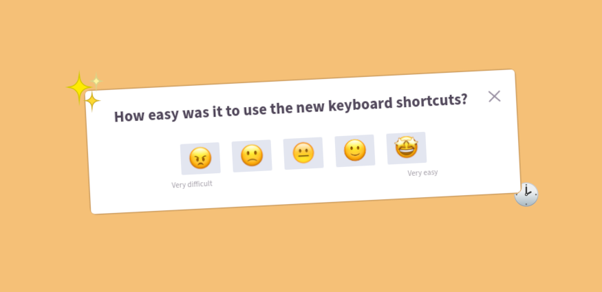
“A well-designed user interface could raise your website’s conversion rate by up to 200%, and a better UX design could yield conversion rates up to 400%.” When a visitor lands on your online business the first point of contact is your website, and if your UI/UX doesn’t beat the benchmark you’ll see a huge increase in the number of dissatisfied customers.
4. Lack Of Testing = Inefficient Website
As I mentioned before often businesses underestimate the importance of a good UI/UX development plan but it’s the biggest mistake you can make.
I would highly recommend you thoroughly test your user interface to ensure that you’re providing an efficient user experience. Launching an interface without testing might cause errors which can lead to a highly inefficient website and dissatisfied customers.
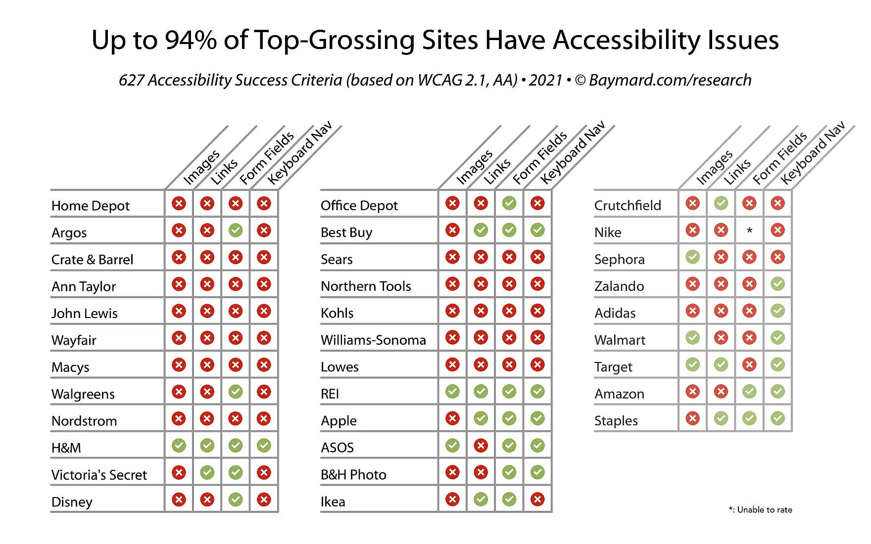
5. Low Accessibility = Loss Of Customers
One of the biggest drawbacks of bad UI/UX is the low accessibility of your website. And as you know the biggest consequence of low accessibility is the loss of customers. You’ll be amazed to know that 94% of eCommerce websites still have severe issues with basic accessibility.
6. Wow Effect = No Effect
The desire to create a website with exceptional UI elements can be tempting but is it really good for user experience? Let me tell you the biggest mistake that you can make with your UI and UX is omitting readability and simplicity from your website.
Creating an interface where users can easily place their orders and be loyal customers should be your main objective. No matter how many lead-capturing elements such as CTAs or forms you add to your website don’t forget to make them readable.
Do You Think Your Website Needs A Redesign? We Have Something!
So these were major consequences you might have to bear if you have a poor UI/UX design for your online business. Now let’s see how we can recognize these elements and weed them out to give your users the heavenly experience and boost lead conversions.
How To Recognise Negative Elements?
Now we know that bad UI/UX is a big no-no, therefore it’s very important to know how to weed out the negative elements that are impacting your lead conversion rate. Now we’ll be looking at some methods for detecting issues to weed out the pain points:
Friction Logging
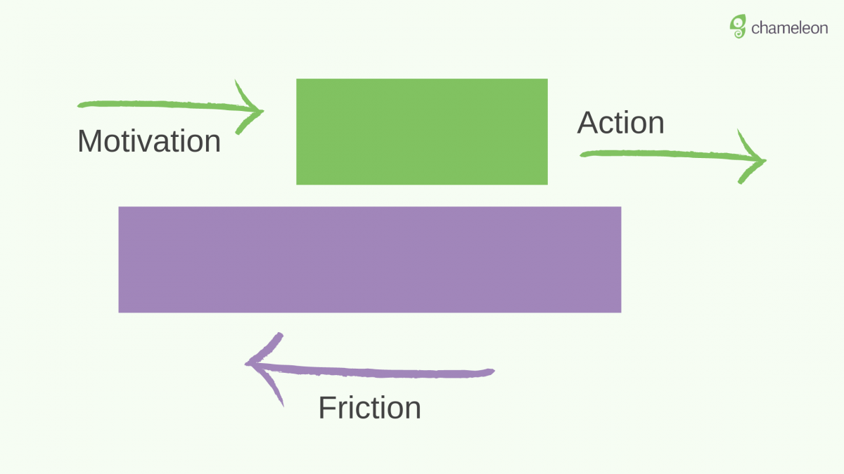
A friction log is an output of a UX exercise where the user details their emotions at every step of a product journey.
In simple words, a friction log is basically a document that captures all the challenges that a customer encounters while accessing your website. The friction logging method deeply understands the useability of your business platform and then, digs where friction occurs in the entire design.
Friction logging gives you the best chance to surface actionable surfaces for optimization.
Behavioral Analytics
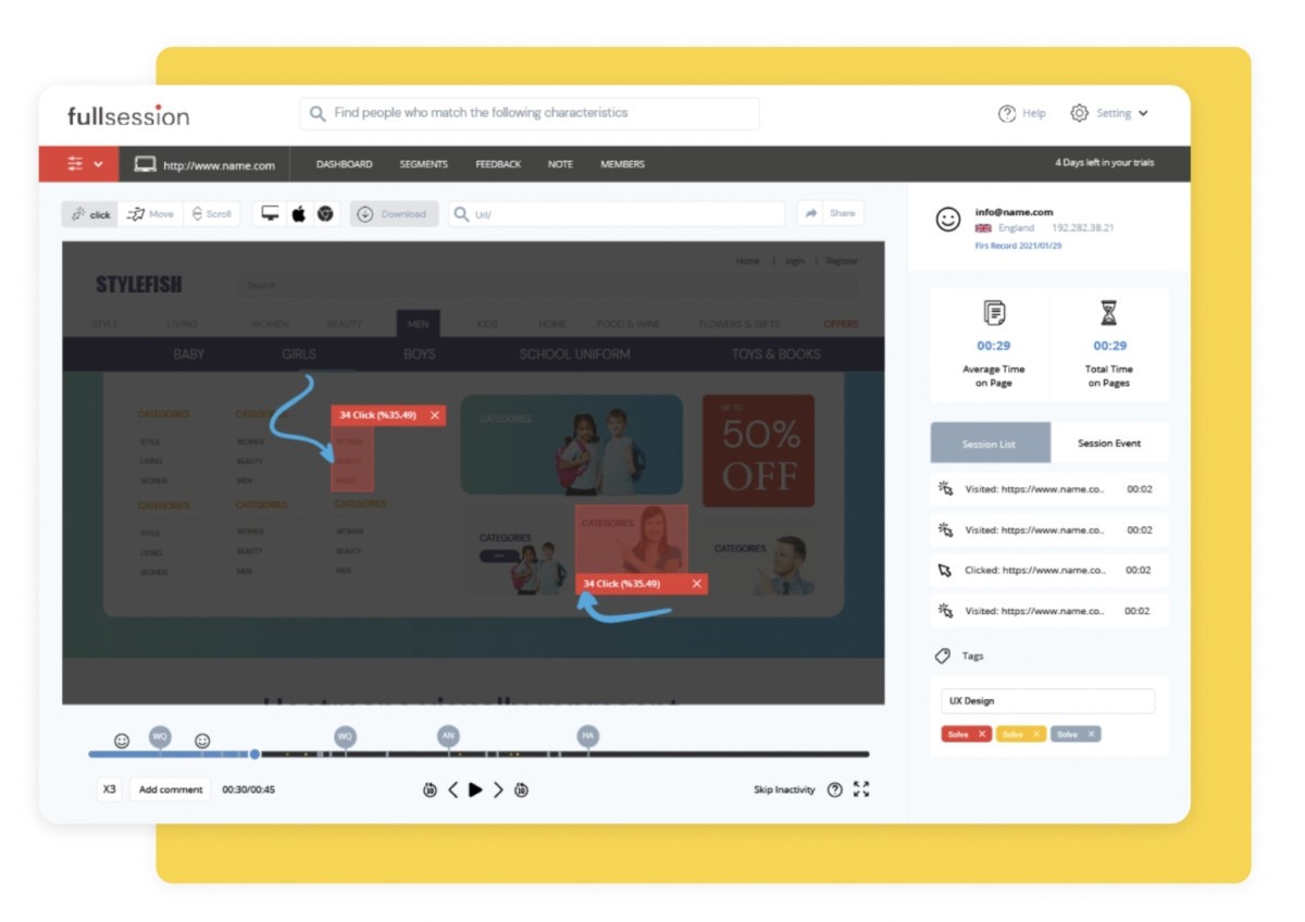
As the name suggests –
Behavioral analytics refers to the process of closely monitoring the users’ interactions with your website.
This is an amazing method where you can closely look at user actions and identify the potential challenges that they are facing. The best thing about behavioral analytics is that it eradicates all the guesswork and helps you have a close look at the buyer journey.
User Feedback
User feedback is the simplest method that you can ask for finding errors in your UI/UX website design. There is no fixed approach for collecting feedback you can try a lot of things to the process effectively, such as –
- Use self-serve feedback forms which is a low-effort passive channel, but the drawback is that you won’t get much specific information.
- Next is the outbound approach where you personally engage with your customers first-hand by calling and emailing them.
- Last is the micro-survey which is a very context-specific user survey and the best your customers love them because they are more intent-based.
Here are some important resources:
So now you know how to find the negative elements in your UI/UX design let’s see some really simple tips to improve them.
Tips To Improve Your UI/UX Design
1. CTA Design & Placement
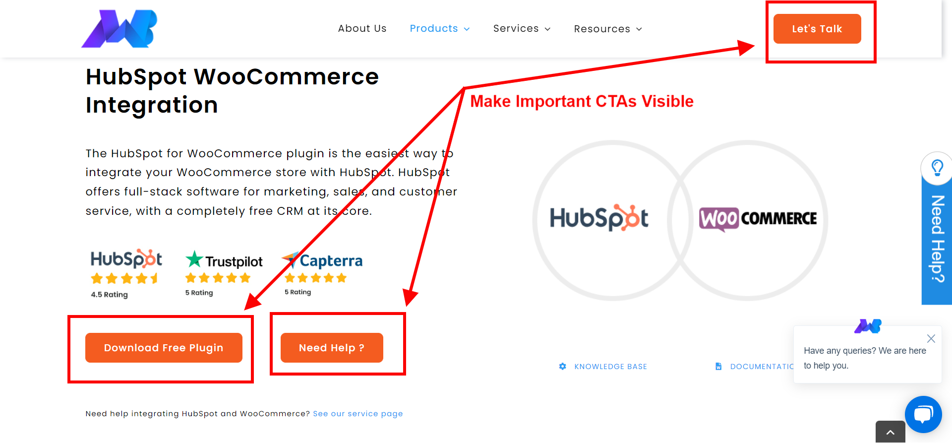
Where you place your CTAs greatly influences the customer’s user experience. If they’re hard to read or recognize they are more likely to go unnoticed and less likely to be clicked.
CTAs are an integral part of the lead conversion process but they only work if they are effective. There are two most important factors that you should consider while designing your call-to-action buttons:
- Firstly, choose a color scheme that doesn’t hurt the eyes of your customers and is identifiable on a product page.
- Secondly, write a CTA copy that conveys the right message.
Compelling Call-To-Action (CTA) Buttons: A Comprehensive Guide
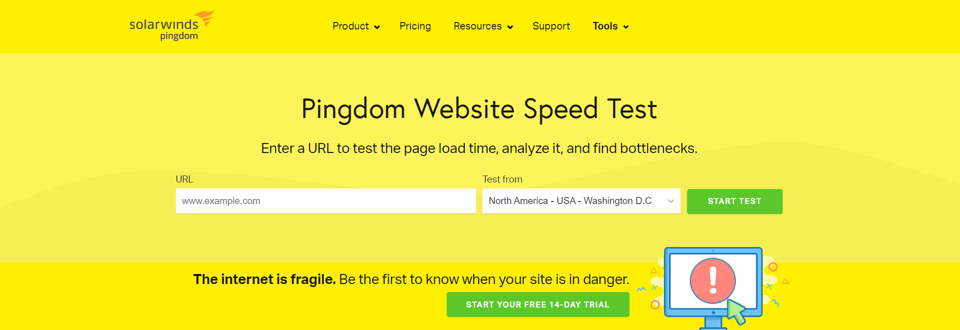
2. Quick Load Time
In this fast-moving world, no one wants to wait and the same applies to your customers. Slow-loading pages and internal server errors are big setbacks for your UI and UX. In fact, slow pages have a negative impact on your SEO too.
But how do you know your website isn’t fast enough for your leads?
You can always take the help of speed check web applications such as Pingdom’s Website Speed Test for finding the performance of your website and finding key areas of improvement.
3. Keep Options Limited
Distractions are a mole in your perfect UI/UX design for lead conversion.
Providing your visitors with too many options on a landing page can overwhelm them and delay their positive buying decisions. Let’s understand this theory with the help of the Hick-Hyman law which describes the time taken by a person for making decisions as a result of possible choices.
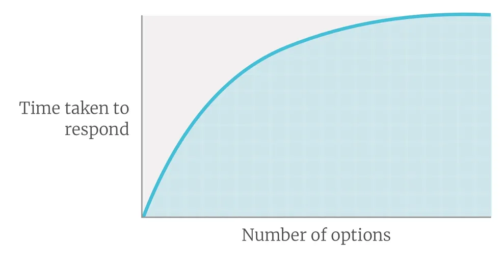
According to the law, the more choices we offer a user; the longer it will take for them to decide. Consequently increasing their chances to abandon the site. There’s another fact we can conclude from this law:
4. Rule Of Thirds For Composing Visual Elements
The Rule Of Thirds is an age-old technique used in fine arts and photography for composing visual content like images, films, and photographs. But nowadays these techniques have become extremely popular among web designers.
So it starts by overlaying two vertical and horizontal lines that are evenly spaced.

Source: DevriX
The dots in the above diagram refers to the points where a user’s eye automatically drifts when looking at a scene. This helps in figuring out where to place the important elements of your website while planning your website design.
5. Ensure Proper Navigation
38% of people visiting a website for the first time look at the layout or navigational links on a page. This means if your website is difficult to navigate there are high chances of losing your customers’ trust, therefore it’s very important to provide them with a sitemap to help visitors guide through the website.
6. Choose Your Color Palette Wisely
I shared the importance of color and contrast when we discussed CTAs but, it implies to your entire website. Not only do they improve your website’s readability also, but they are also responsible for making your website stand out from your competitors.
Design A Unique And Memorable Logo For Your Online Business
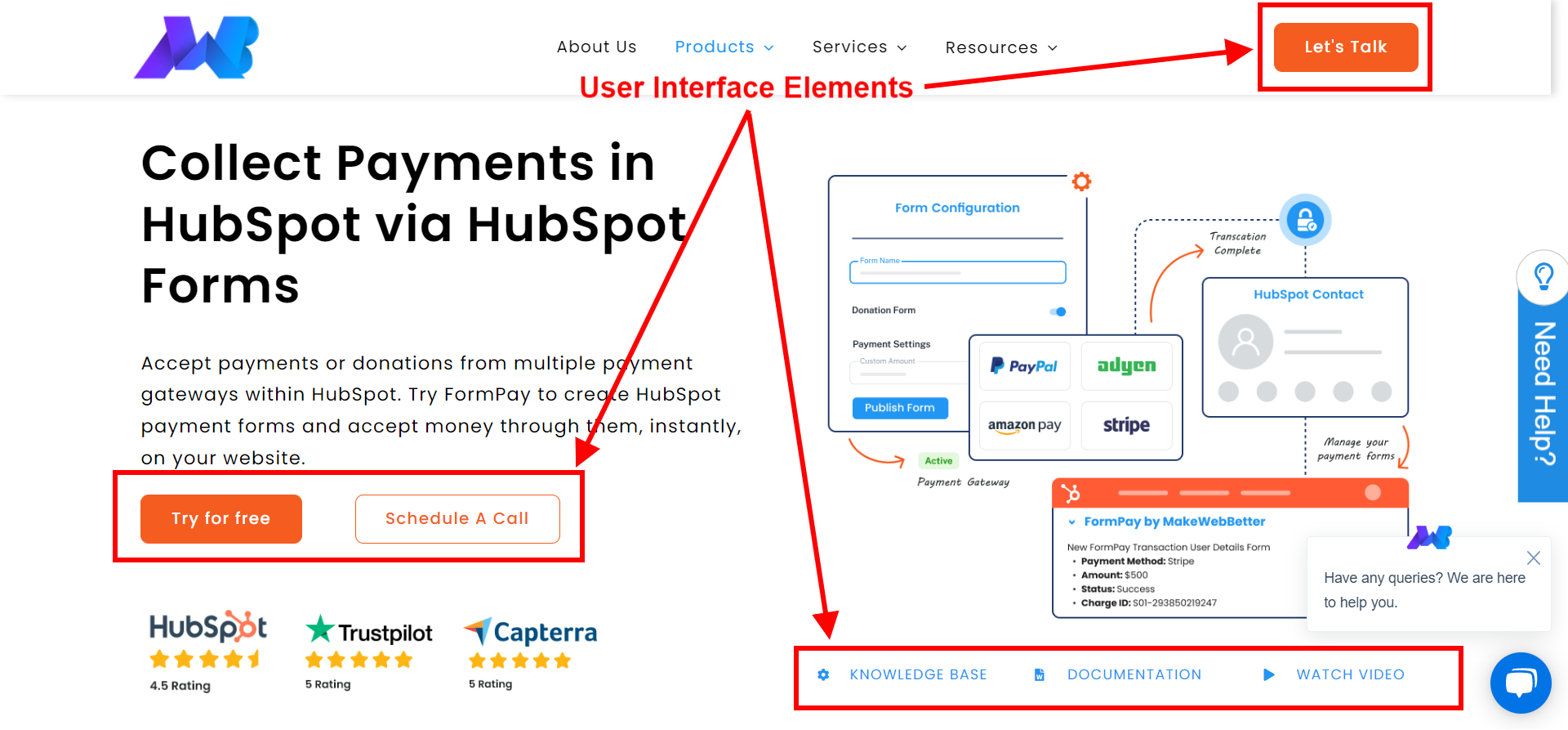
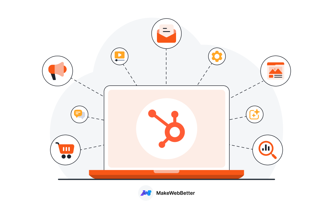
7. Invest In A CMS Platform – MakeWebBetter Exclusive Tip
So here’s a bonus tip from team MakeWebBetter – Invest in a CMS Platform.
A content management system or as we know CMS plays a crucial role in managing and handling the digital assets of your website efficiently. If you browse the internet you’ll see a lot of options available such as WordPress, Joomla, and Wix but today I’ll share an amazing option with you. I speaking of HubSpot CMS.
In our previous articles, we covered a lot of insights on the Hubspot CMS and how it is an amazing platform for website owners with zero coding knowledge. Let’s revise some of the benefits of handling your website with the HubSpot CMS:
- The HubSpot CMS Hub gives SEO recommendations that allow you to take action for a better ranking opportunity over the SERPs.
- HubSpot CMS comes with pre-built website themes which are basically templates that are fully customizable.
- CMS Hub comes integrated with HubSpot’s very own CRM.
- It has a drag-and-drop editor that lets you update and create web pages without a developer’s help or custom code.
How To Grow Better With CMS Hub Starter?
UI/UX Design – Not About Just A Beautiful Appearance
Finally, we’ve reached the end of our article. And as far as I can see, UI and UX development has a major contribution to user satisfaction and a business’s success. With an impeccable design, you can humanize technology and instantly grab the attention of your customers.


Thank you for sharing your thoughts! I completely agree with your points and appreciate your clarity on the subject.
Rule of thirds is pretty interesting concept. Thanks for the overview.