According to researches and surveys conducted, the average cart abandonment rate during the eCommerce checkout process is 70%.
What does it tell? Out of 10 checkouts you are failing in 7.
But what’s the reason for these abandoned carts?
Why are you failing and what is the reason for a successful eCommerce checkout?
If you are also facing such issues with your store and looking for the reason for an abandoned cart, then you are at the right place.
Buyers are looking for a frictionless checkout experience.
In this blog I’ll try to put best practices you can follow to improve your eCommerce checkout experience and can reduce abandoned carts.
As marketers and online store owners, you must have come across this situation a lot many times — confused you might have tried many hacks and tricks available in the search results to boost your conversion rate and sales.
But, have you ever thought about resolving the core issues that are causing you the same trouble of cart abandonment frequently?
Well, I know you must have. And if not, now you have the chance to improve because as they say, it’s never too late!
Table of Content
- What is an eCommerce Checkout Process?
- What is An eCommerce Checkout Abandonment?
- Why Customers Abandon You During The Checkout?
- Strategies To Improve eCommerce Checkout Abandonment
- eCommerce Checkout Page Design: UI/UX For The Perfect Checkout
- Email Marketing: A Simple Way To Recover Lost Carts
- Best eCommerce Checkout Softwares For 2020-2021
- Checkout Page Examples
- eCommerce Checkout: It’s A Never-ending Process!
1. What is an eCommerce Checkout Process?
A checkout process is a multi-step payment process that your customers undergo to complete a purchase.
Steps Of eCommerce Checkout Process
- The eCommerce checkout process starts when customers click on the “shop now”, “buy now” or “checkout” button from the shopping cart page.
- The next step is where you take in the billing and shipping information from your customers.
- Once all information is fetched in, the customers are navigated to select the “mode of payment” and the shipping methods.
- Next is to proceed with the order confirmation and Voila the order is placed by your customer.
This basic eCommerce checkout process, as simple it seems but isn’t. Every online store follows its own checkout policy. But face a common issue of cart abandonment. And cart abandonment causes eCommerce businesses a loss of hundreds of billions of dollars. Though it doesn’t have to. Only if retailers may optimize their checkout pages, they can recover billions in lost carts.
This article will help you understand the reasons for checkout abandonment, checkout page best practices to improve checkout abandonment, to improve the checkout experience for mobile users, and some best eCommerce checkout software along with some top-notch checkout page examples.
2. What is An eCommerce Checkout Abandonment?
eCommerce Checkout Abandonment is a state of buyers’ shopping journey where the buyer initiates the checkout process but leaves midway. The eCommerce checkout abandonment rate is calculated by –
Checkout Abandonment Rate = Total completed transactions / Total initiated transactions
Note: Don’t confuse eCommerce Checkout abandonment with Cart abandonment as the two are completely different concepts. Checkout abandonment happens when the buyer leaves after initiating the checkout process while cart abandonment happens when the customer adds the product to the cart and leaves your site/e-store.
3. Why Customers Abandon You During The Checkout?
The eCommerce checkout process is initiated! This means that your customer was sure to buy the product. Then why did he leave?
Thereby, the most important thing is to first understand why your customers are leaving on checkout. The proper study of behavioral analytics and purchase funnel analysis will help you determine the reasons for the eCommerce checkout abandonment. However, the most common reasons aggregated considering the online stores are the ones listed below.
- High additional costs or hidden costs
- Forced account creation for the successful checkout
- Complex or lengthy checkout process
- No trust in the website
- The slow loading speed of the website
- False offers
- Unclear return policy
- Obligatory payment options missing and/or failure in card payments
- Slow product delivery
4. Strategies To Improve eCommerce Checkout Abandonment
Since you are clear on the reasons for your stores’ checkout abandonment, you must think of ways to improve it. To improve the eCommerce checkout abandonment rate for your eCommerce business, optimize your checkout page with the checkout page best practices.
It’s obvious that no one-size-fits-all policy exists as every eCommerce website has its own uniqueness and experiences. Thereby the checkout page best practices mentioned below are not the exact solution to get you results but surely an idea to consider when designing your own eCommerce checkout page. Also, these will benefit you in identifying the most important elements while you’re choosing a checkout template. So let’s proceed!
1. Avoid Mandatory Sign-Ups
It’s crucial to make your customers feel comfortable while they shop and not be obligated to uncertainties.
-
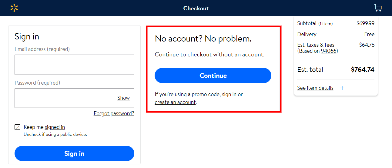
1. Allow Guest Checkout

Source: Walmart
To your surprise, not all your new customers will create an account to complete a purchase. Hence, allowing the guest checkout processes, you will facilitate them to proceed faster, avoiding unnecessary steps that slowed them down earlier making them reconsider their options to make a purchase.
-
2. Include social logins
Why always follow the same old bulky process to let the user create an account in order to complete a purchase. To make it convenient for your customers, including Social Login options is a great alternative. For example, “Sign-Up using Facebook” is the most common social login platform used – not only by eCommerce websites but in games too to support in-app purchases.
2. Offer Free Shipping
Amazon Prime is on boom considering the cut-down shipping charges it offers to members. Thereby, people have started taking the free shipping services for granted and high shipping charges is one of the main reason for eCommerce checkout abandonment. So it’s best, to be honest, and direct about them. Also, avoid adding additional fees entirely if possible.
3. Payment Options
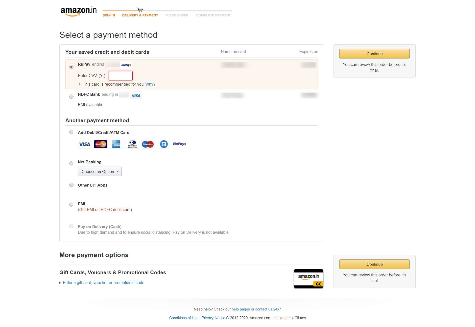
Source: Amazon
All payment gateways are not available in all countries. Also, users have a preference for different payment modes. Do you think your customers will leave the purchase incomplete only because they don’t have the payment option of their choice? Well, they’ll definitely do so. This lays the importance of having as many options to support payment as possible. Prioritize the major payment methods like debit/credit cards, cash-on-delivery, followed by additional payment methods like PayPal, Google Pay, Paytm, etc. The more payment options ensure that more customers will follow through to complete purchases.
4. eCommerce Checkout Page Design
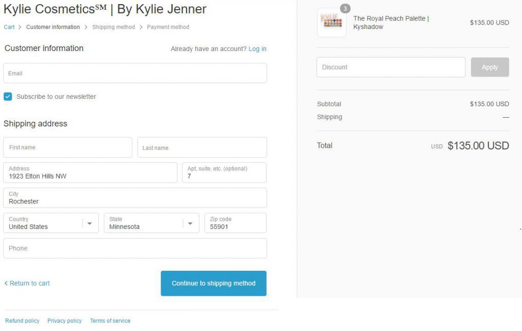
Source: Kylie Cosmetics
Although online retail checkouts lack the annoyance of people waiting in queues; it also lacks the ability to identify the friction points of the buyer’s journey. eCommerce checkout page design is the most critical factor to retain the conversion rates. Therefore, a choppy and messy checkout experience results in cart abandonment. The checkout page has a set of its own design principles, i.e.,
- The length of forms and text fields
- The placement order of payment methods
- The refined flow of the checkout process
- Mobile-friendly UI/UX designs
- Placement of the CTAs
- Offers/ discounts/ cashback banners and pop-ups
- Using progress indicators while going through the eCommerce checkout process
- Take advantage of Google Auto-fill property to ease your customers while filling the forms
And more…
The simple and clean eCommerce checkout design speeds up the checkout process for your customers. Also, the clean layout intrigues the visitor. Removing the unnecessary steps, avoiding unneeded for fields, and streamlining the eCommerce checkout process to make it as efficient as it can be is a great influencer to reduce shopping cart abandonment.
Explore Checkout Flow Design Guidelines For Higher Conversion
5. Show Secured Authority To Build Trust
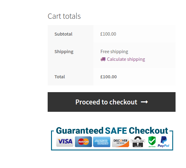
Source: Walmart
Data privacy and security are also a major reason for people to leave the cart in between. How would your customers know that you are a genuine service provider and that their card and bank details are safe while shopping from you online? This implies the importance of showcasing the security badges and building trust among the customers that you have a secured payment gateway and that their bank details are safe from cyber threats.
6. Allow Customers To ”Save Their Carts”
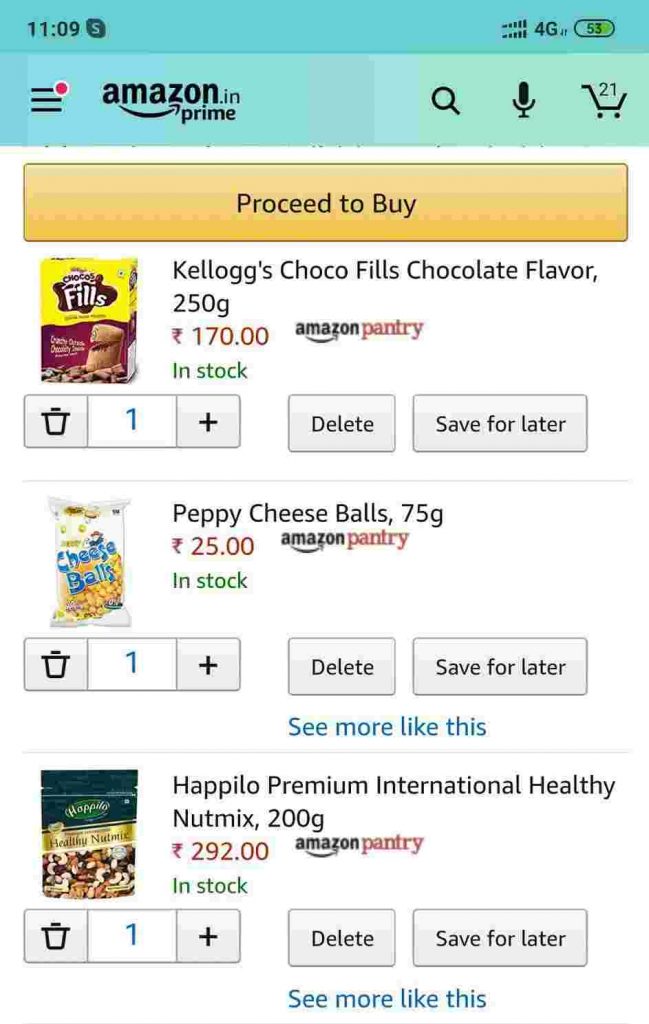
Source: Amazon
Not many online sellers are convinced with this concept of allowing the customers to save their carts for later purchases. But for those who have adapted to this concept, witnessed the results. Providing the option to “save your cart” motivates the customers to continue their pending shopping first along with their other requirements.
7. Send Notifications & Reminders To Your Customers
Before you set notification and follow-up reminders for your customers abandoning during the checkout or have already abandoned the eCommerce checkout process, analyze their behavioral funnel. It is important to analyze the behavior and shopping funnel of your customers because then you’ll have a clear picture of what has happened and if not that, you’ll at least have the clear points of prediction. Considering the data, determine the leaks, prioritize the biggest drop-offs, and confine ways of improving eCommerce checkout abandonment rates.
- Prompt users with a pop-up to ask about their exit intent
- Apply feedback forms for future iterations
- Allow auto-saving carts so that customers can return to where they left.
- Connect with users on support or calls to understand the issues they might have encountered through the checkout process.
8. Run Abandoned Checkout Email Campaigns
Take follow-up from the customers who abandoned you during checkout by running an email campaign. Email campaigns are a set of sequential emails sent at defined intervals to the customers and for that, you only need their email address. Send a feedback email foremost to avoid seeming pushy.
You can also ask your customers to resume their eCommerce checkout process from where they left off. If you get a positive response then you have successfully turned the abandoned cart into the sale. But not always is the same case. Hence, you can try providing the additional discount offers, or can simply follow the process of email remarketing to recover the lost customers. Email remarketing involves three steps –
- A gentle reminder to the customer of the abandoned cart/checkout process
- Offering the customers a discount or a coupon to motivate them to complete the purchase.
- The final reminder to make them complete the purchase process abandoned before within a certain time period or else the initiated process will be dropped-off.
Email remarketing is a simple concept followed under the consideration of email marketing.
Is That All?
Well, these were not all. There are many more practices and unique ideas that can be implemented to improve eCommerce checkout abandonment. However, when checkout page optimization is done, the checkout page design also requires equal consideration to get the most from the results.
eCommerce Checkout page design, as simple the concept seems, it isn’t is. There are many conflicts prevailing regarding the checkout process flow designed in a single-page and the ones designed for multi-page processes. Also, the consideration is required for the responsiveness of design as these days people often prefer shopping online using their smartphones and not the heavy desktops.
The next section of the article explains the two concepts in the most refined yet precise manner. Let’s head forward!
5. eCommerce Checkout Page Design: UI/UX For The Perfect Checkout
Providing a better eCommerce checkout experience to your users is your ultimate reason to read and learn about the checkout page best practices. Along with all the external factors, the major factor affecting the conversion rate is your checkout page design. Further in this section, we’ll discuss two main concepts for the checkout page design –
- One-page checkout process Vs Multi-page checkout process
- Mobile-friendly checkout page design
1. One-Page Checkout Process Vs Multi-Page Checkout Process
Since we’re talking about checkout page designs, the knowledge of the difference between the one-page checkout process and the multi-page checkout process is equally important.
One-Page Checkout Process |
Multi-Page Checkout Process |
|
A one-page checkout process concept was defined to simplify the appearance of the checkout page. It also aims to create a checkout process with fewer clicks as all the standard elements will be included on the same page. With standard elements, I refer to the basic cart items, billing and shipping information, payment methods, and any additional information that the customer wishes to instruct. Pros:
Cons:
|
As we know that a checkout process is traditionally a multi-step process. Therefore, a multi-page checkout process splits each phase of the checkout process into a separate page. It is a detailed and lengthy process where each page has a separate form to capture the customer details. And customers have to fill in the information at each page to proceed ahead with the checkout process and complete it. Pros:
Cons:
|
2. eCommerce Checkout Page Design: Improve Checkout Experience For Mobile Users
The mobile-friendly UI/UX design for the checkout page is as important for the eCommerce businesses as the icing on the cake.
Lately, it has been observed that there are more users using mobile phones for shopping online than the ones using a tablet or a big screen like a laptop or computer. It is handy, time-conserving, and convenient in many ways for the users to shop from their phones.
Hence, the eCommerce store owners need to optimize their eCommerce checkout process considering all their audiences while giving an upper-hand to the mobile audience. And to do that, we have tried to compile some of the best mobile designing rules and concepts for you to have a look. These designing rules are often referred to as the mobile checkout best practices. Though the terms are used interchangeably, they refer to the same learning intent, i.e., the optimized mobile eCommerce checkout page design.
Let’s head on!
-
1. The Thumb Rule
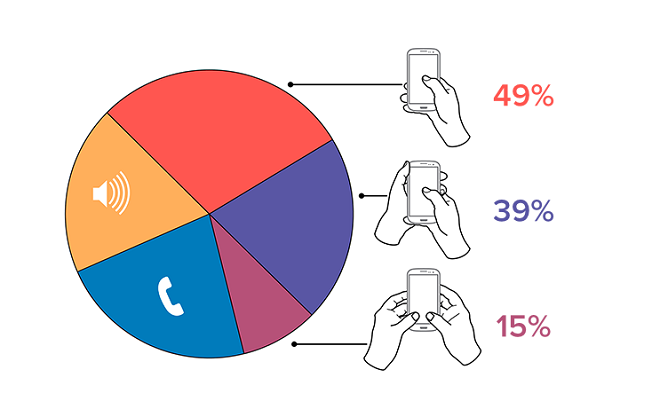
Talking about smartphones and mobile devices, one can never be stringent to the design. Because the holding of mobile devices is not static. Even, I sometimes scroll the screen with my right hand. Then in a few seconds, using both hands for typing or zooming. Again, shifting back to one hand and so on. And this is the most genuine case with 99% of mobile users. They don’t have any static method to hold or use the device.

Figure: How People Hold And Use Mobile Phones | Source: uxmatters.com
With such dynamic situations, we considered what data told us! As per the data provided by UXmatters.com, i.e.,
- For one-handed use –
- right thumb on the screen—67%
- left thumb on the screen—33%
- For cradling with –
- thumb on the screen—72%
- finger on the screen—28%
- For cradling in –
- left hand—79%
- right hand—21%
- For two-handed use when holding the phone –
- vertically, in portrait mode—90%
- horizontally, in landscape mode—10%
- For one-handed use –
-
2. Use Page Breaks And Scroll Breaks
Although a one-page checkout process design is preferable, long scrolls can be irritating. Therefore, while optimizing your checkout page for the mobile, make sure you use proper categorization for each section.
These categorizations can be done in multiple ways that suit best to your e-store. But ideally, 2 main processes are followed.
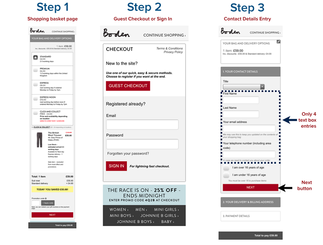
- Categorize and divide each checkout section into different pages that appear simultaneously one after the other. So that your customer can feel the continuity in the eCommerce checkout process without getting irritated from the long scrolls.

Source: Google Images
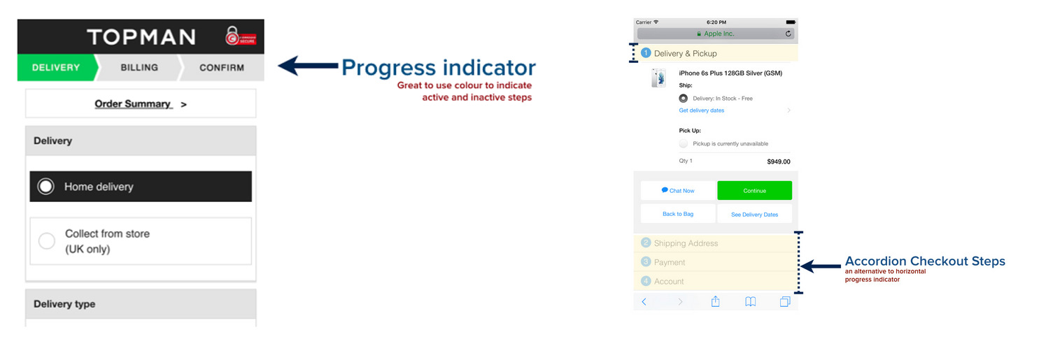
- Use progress indicators either horizontally or vertically. These progress indicators are really helpful when you’re willing to divide the checkout process into sections without using the multi-page concept.

Source: Google Images
3. Text-Fields, Labels, Buttons, And CTAs
Data input in form fields is already a tough job since the mobile screen has limited visible space further reduced by the inbuilt keyboard. Thereby, designing an eCommerce checkout form that is responsive to the mobile screen for a speedy and smooth transition.
- Use an HTML “tabindex” attribute to carefully specify the form fields’ order sequentially, from the top to bottom of your checkout page. This will enable customers to move swiftly between input fields.
- Take on a stacked design approach and align each text-field in each row along with a label specifying the purpose of the text-field to ensure a smooth sequential transition through the checkout form.
- Enable auto-detect/auto-fill support and trigger numeric keypad while entering the card details and/or contact number details.
- The buttons are the most important part of the checkout page. Ensure to highlight the button with a contrasting gradient rather than putting just a link.
- Button size and placement of CTAs are also important and while adding these to your checkout page, you must remember that your mobile screen has limited screen space and that your thumb captures wider space than mouse pointers. Therefore, design the button large enough to be easily clicked by a single thumb touch with no struggle.
- If you’re adding a Call contact number to provide direct customer support to your customers, make sure you mention it big enough to be clearly visible and small enough to keep it from capturing your full-screen space. You can also add a small phone icon along with the number to enlighten your customer on the purpose of the number mentioned.
It is time to decide the right fit for your store!
6. Email Marketing: A Simple Way To Recover Lost Carts
More than 70% of your customers abandon during the checkout process. And researchers claim it to be increasing in recent years. And, spending lots on paid ads is a “no-way-out solution”. Online marketers often spend a lot on paid searches and Ads to gain more qualified leads. But, acquiring new leads is of no purpose if the leaks in your funnel are paving them a way out.
Email marketing is hence a proven technique to recapture and nurture the leads. It is therefore equally beneficial in acquiring abandoned carts back. The abandoned cart email campaigns are similar to the one explained above, i.e., email remarketing.
And, you might now think that why am I going all along with the same thing again? I assure you that this section will be as helpful to you too because here I’m going to reveal a few strategies to recover abandoned carts. Not taking much time, let’s proceed!
Strategies To Recover Abandoned Carts With Email Marketing
-
1. Build Trust And Credibility
Building trust and credibility via the emails you share to assure that it’s you and the mail you sent is a no spam. This will let your customers know that it’s safe for them to open up their wallets and that there will be no fraud happening to them. This is most essential while you plan to send a follow-up mail to your customers, i.e., your first step of email remarketing.
-
2. Leverage The Benefits Of Loyalty Programs
As you must have read above, the second step or phase of email remarketing is sending coupons and discount offers. But sending the discount offers every time will drop-off your profit margins. Also, regular discounting will devalue your product and you never know when the nasty customers start taking benefit of your efforts. Thereby, customer segmentation is important at this step. Segment your loyal customers to offer them discounts for being loyal to your company because you know that they’ve been choosing you for the past many times. And for new and one-time customers, try to convert them into loyal customers by convincing them to be a member of your loyalty program and gain extra benefits or win gift cards. Gift cards and loyalty rewards are easy attractions that don’t cost you much but surely give better results.
-
3. Be Constant, Not Pushy
After you’ve sent a few emails to the customers regarding the abandonment of the checkout process or the cart and have given the opportunity to revive the process. But you don’t see any revert from the respective customer. Then leave the process there, not your customers. There could be other reasons for cart abandonment too than the usual expected ones.
-
Therefore, try to connect with your customers on-call or send push messages to connect with them for the feedback. Take an interval before you plan to send them another email regarding your fresh arrivals, top-rated products, or the latest trending offers. This is your easy marketing tactic to keep reminding your customers that they can come back to you anytime and make a purchase with good deals. It will not only help you in building a longer-term connection with your customers; it will also help you in bringing your products in the limelight for your customers.
7. Best eCommerce Checkout Softwares For 2020-2021
1. WordPress WooCommerce One Page Checkout Plugin
This plugin enables a one-click checkout button to be added to a product and shop page. Once clicked, customers can choose between adding a new shipping address or using an existing shipping address. This allows customers to skip adding items to their cart and immediately proceed to payment.
2. WooCommerce One-Click Checkout
The WooCommerce One-Click Checkout plugin enables customers to make online purchases and move directly to the Checkout page rather than “Add to Cart”. The checkout page holds the predefined user information for the checkout fields and the final option for adding product variation. Checkout button integration makes the checkout extremely fast and frictionless for customers that are already registered with your store.
3. YITH WooCommerce One-Click Checkout
This plugin enables a one-click checkout for customers enrolled on your eCommerce platform. This checkout plugin speeds up the eCommerce checkout process and makes it smooth for the registered customers.
4. WooCommerce Checkout Manager
This plugin allows customization and management options for WooCommerce checkout page fields. It allows your customers to re-order, rename, hide, and extend fields within shipping, billing, and additional sections.
5. WooCommerce Easy Checkout Field Editor
This plugin is simple to use as a field editor. It lets you customize the checkout form fields. Add, delete, and edit form fields to create an order form that is ideal for customers.
6. WooCommerce Converting Checkout Pages
The WooCommerce Converting Checkout Pages plugin helps you in creating the most important page of your eCommerce site based on the products you sell and get more sales by presenting the best upselling offers to your customers, with a high degree of customizations.
8. Checkout Page Examples
Listed below are some of the top favored ideas of the checkout page that fetch great results in cart abandonment rates. These pages are so preferred because they have chosen and implemented the checkout page best practices time and beyond to keep their customers at ease while they are at the most crucial step of conversion.
1. Bellroy
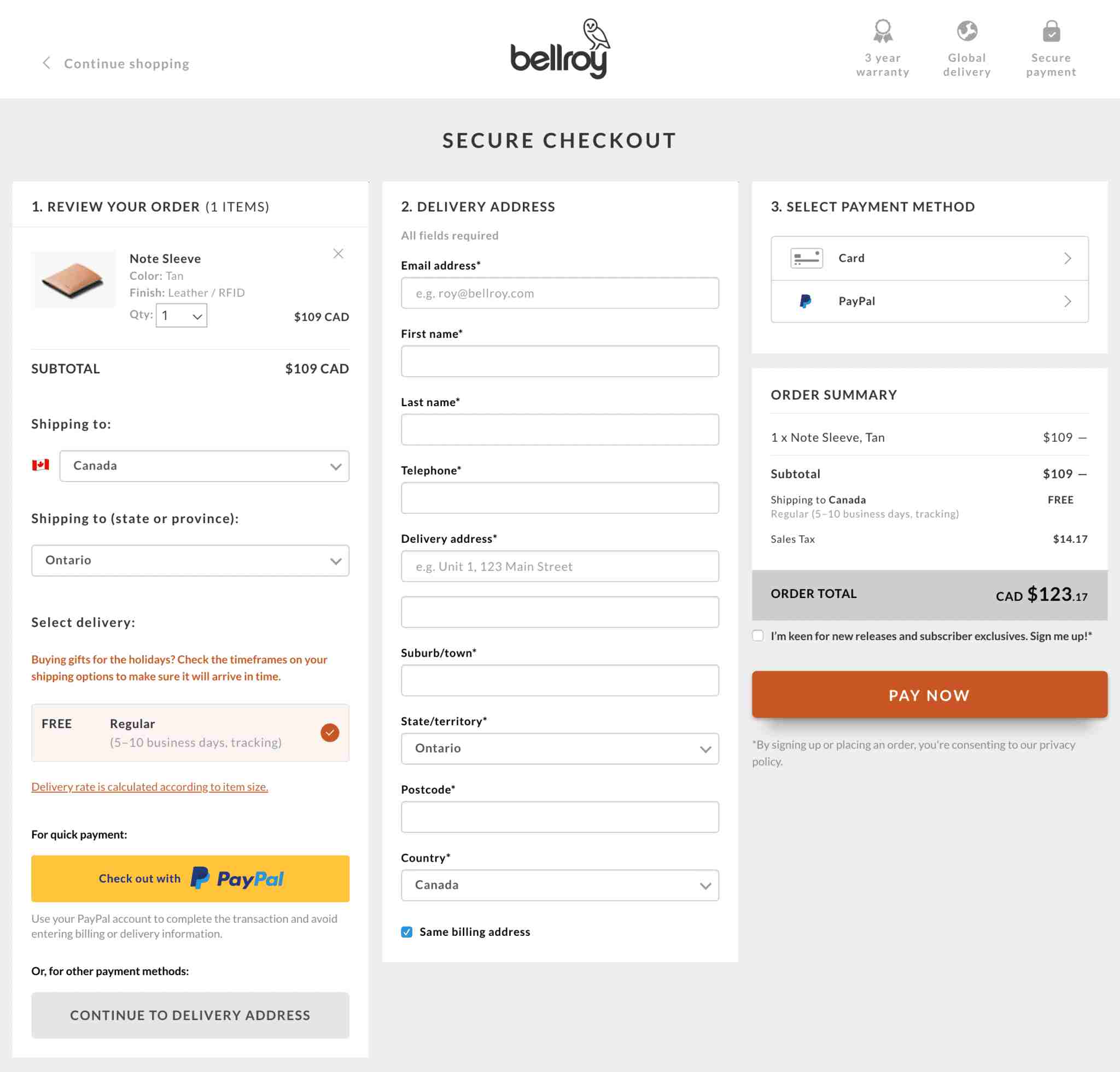 Bellroy has one of the best-planned checkouts. It is structured as a multi-step checkout process confined to a single page. There are no hidden surprises and the information is displayed direct and upfront to keep their customers all informed. The form data validation and error notifications practice are also infused in their design to ensure accurate information is entered by the customers.
2. AliExpress
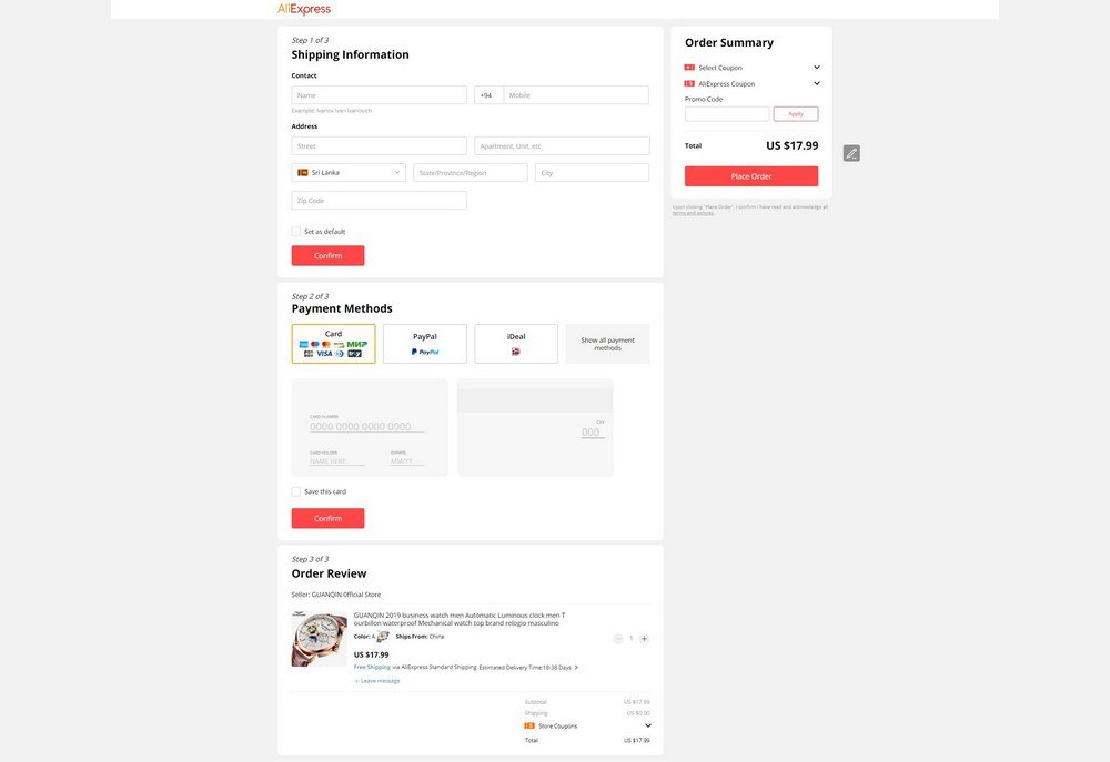 AliExpress confides its checkout process in 3 steps. The attraction of this checkout page is that minimal information is taken from the customer and the payment options are clearly visible through the logos used to segregate each payment method. The information fed in any step can be altered anytime, even when you’re at the last step.
3. Nordstrom
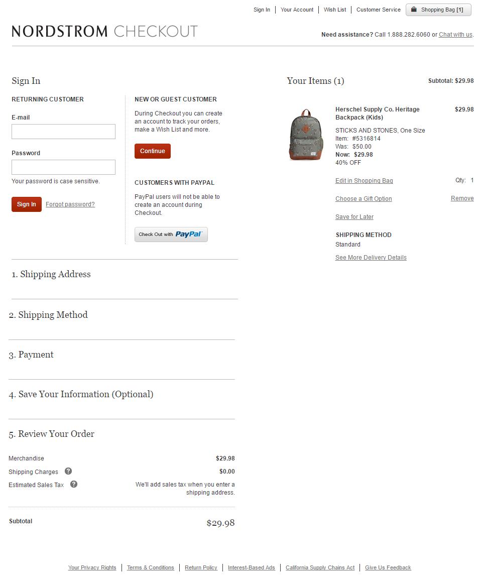 The Checkout page design of Nordstrom is although a one-page checkout process but is fairly detailed without giving the burden of filling so much information to the customer. The cart section, shipping section, billing, and payments section are clearly differentiated to avoid confusion and clutter.
4. Myntra
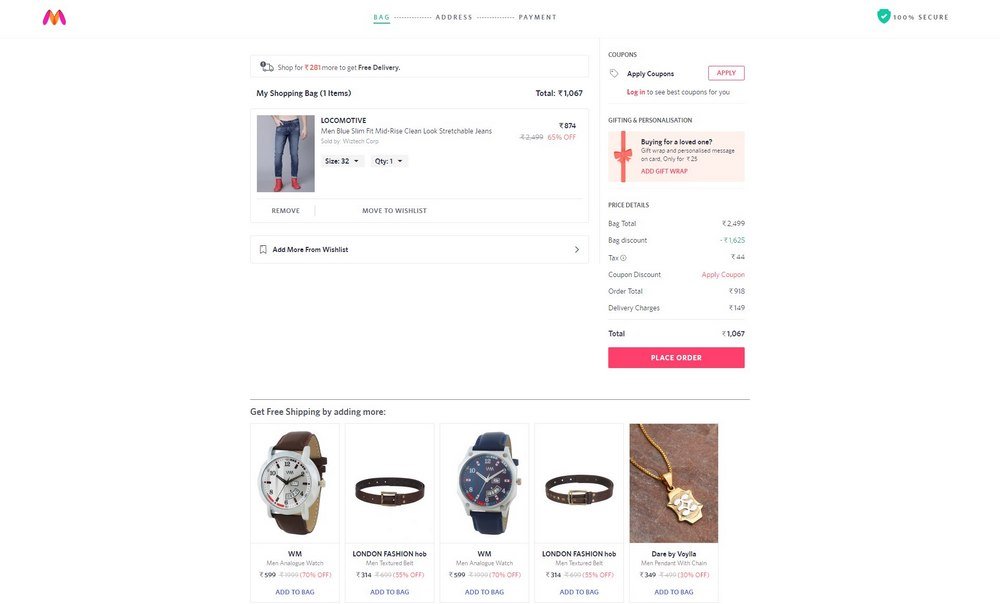 The online clothing and accessories store Myntra has one of the fastest-loading checkout pages. The attraction here is that Myntra allows its customers to add the items to the cart from their wishlist as well from the checkout page itself. However, it doesn’t allow the guest checkout. The user needs to have an account to complete their purchase from Myntra.
5. Crate&Barrel.com
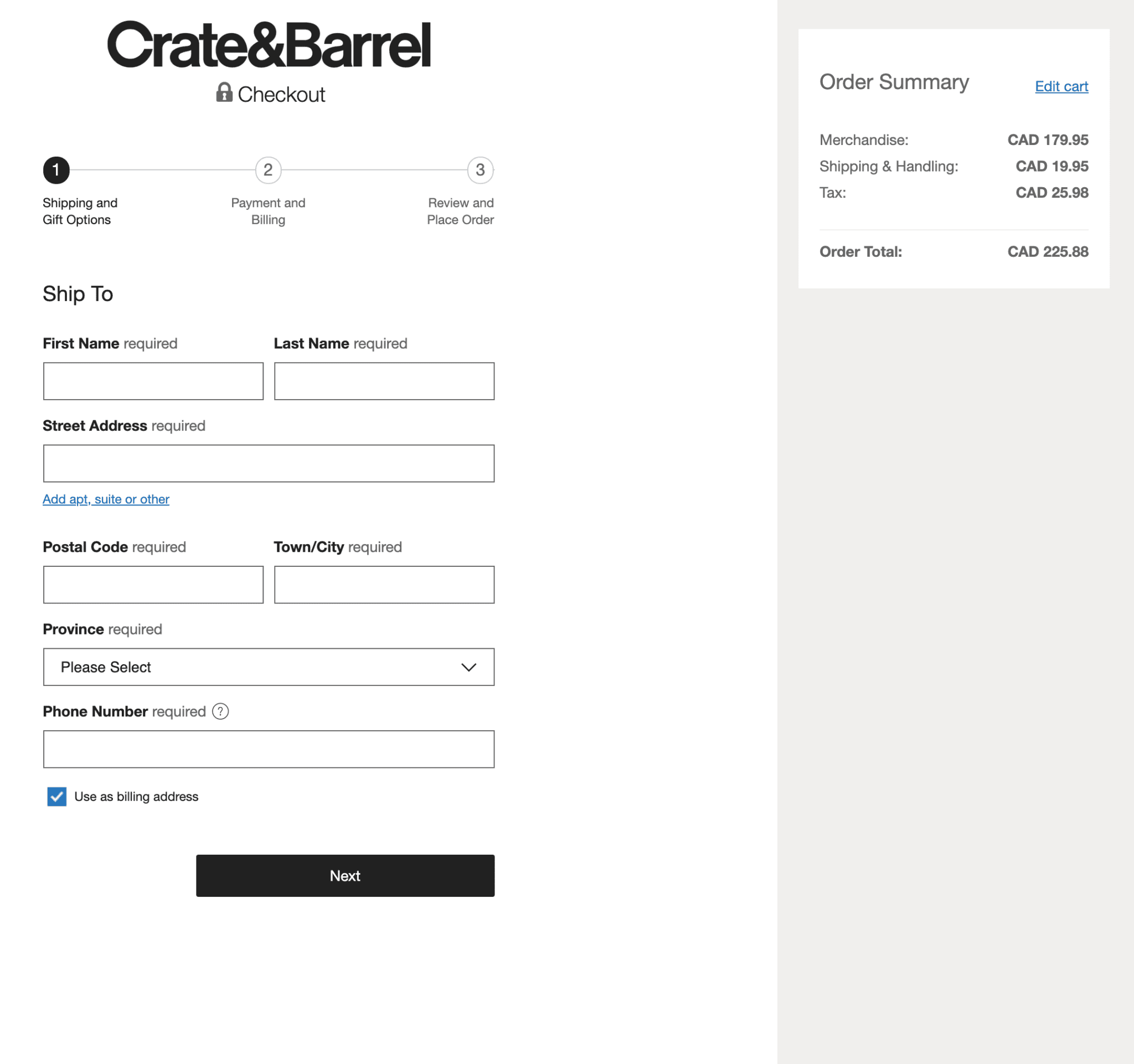 Crate&Barrel is an epitome of perfect single-page checkout following almost all the best practices to reduce cart abandonment. They show order summary, make use of progress indicators, clear and clutter-free checkout form, additional costs are pre-defined, and connect customers to support via chat.
eCommerce Checkout: It’s A Never-ending Process!
Now you know the eCommerce checkout page best practices to optimize your checkout page and get the best results by reducing cart abandonment rate and optimizing the conversion rate. But make sure, to regularly analyze and test your design to keep it optimizing regularly. Optimization is a never-ending process. And regular analysis will help you in observing the best design approach that works for your store.
While you plan to outsource your page analysis processes, feel free to connect with us at MakeWebBetter.com. We’ll be happy to help in any manner we can.



thanks for sharing the good information.