

It is nice to track most of the paths to your website that drive traffic, but is that enough?
After reading this material, you can easily understand the channels that play a prominent role in making visitors convert after coming to your site, and you’ll get a Google Data Studio advance funnel reporting template that will help you evaluate channel results.
You want to share your site with many others. More specifically you want them to connect with your website and eventually take some concrete action such as making a donation, registering, ordering, etc. We know that all the channels do not perform the same, it depends on how you are analyzing them. There are different conditions for evaluating different channels such as some channels being liable for direct purchase, others performing really well in assisting, other channels just to improve traffic and many more.
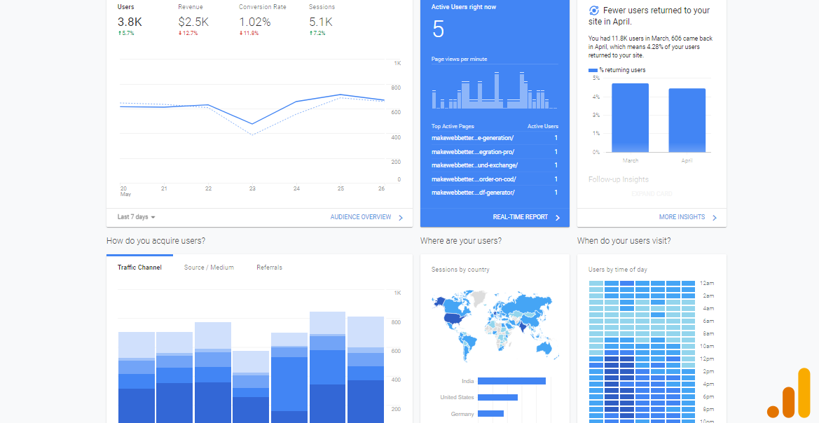
Google Analytics helps you to analyze your different traffic channels in the “Acquisitions” section.
Select “sources” and “mediums” where you can monitor your traffic.
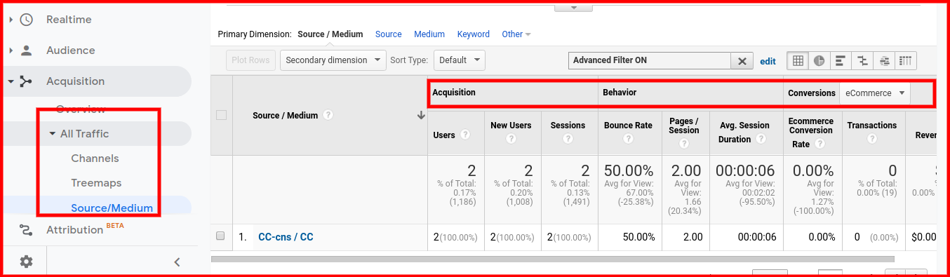
As you can see in the image there are three sections-
- Acquisition – The acquisition metrics explain how much traffic each of the different sources is bringing to your website.
- Behavior – Behavior metrics show you traffic output that comes from each of the various channels. It’s important to note that quantity is not everything (as illustrated in Acquisition). You have to make sure that each visitor gets a great experience coming from any channel.
- Conversions – This is the most important type of data for any website. According to the goals you have set up, these reports show you which channels are driving most visitors that ultimately take action. (If you haven’t set up goals on your site, follow these tips).
You may think that this gives you every single point you need to understand the channel results, but there’s still a lot to examine that I discussed in the Google Data Studio funnel reporting.
Google Data Studio Funnel Report Template Overview
Google Data Studio is one of the best data visualization sources, and we can connect over 300 data sources and generate an attractive and dynamic report. Various maps are available to make the study simpler for both your customers and yourself to grasp.
My funnel reporting template is a combination of funnel and pivot tables. In this Advance reporting template, you will be understanding-
- Top Traffic Sources.
- No. of users visiting per month from individual channels.
- Visitors who are converted into leads from individual channels.
- Leads that are converted from individual channels.
- Proper funnel visualization of all these steps.
- Percentage of visitor’s conversion following the funnel on each step.
- Which is the best combination of generating a large number of leads? Say, A combination of the top month with channel or a combination of top channel with month.
- Which are the top leads converting month?
Template Explanation
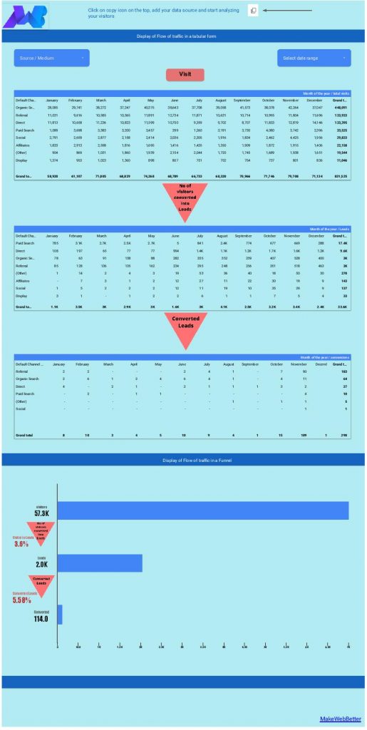
This is a screenshot of the Google Data Studio funnel reporting template. Here you can see I used three pivot tables to differentiate visitor types.
The first table contains visitors who are landing on your site. Then visitors who are converted into leads are segmented in the second table and the leads which are converted are categorized in the third one.
In the next chart, I use a funnel that follows the same pattern as the above table. There are some additional details like you can check the percentage of traffic moving to the next funnel and additionally you can select individual channels by filtration and analyze the performance separately.
Why Is Funnel Analysis Indispensable?
This is really important because some funnel may be good in converting traffic to leads but then from leads, the conversion percentage tends to depreciate. Conversely, there may be a funnel where the lead conversion is low but the final conversion percentage is high.
The funnel analysis of a single channel helps you to determine the areas of improvement. Similarly, we can analyze every other channel using this funnel analysis and compare for best results.
A funnel analysis shows you where your users are dropping off along the conversion path. You can use it to figure out where the biggest opportunity is to make improvements.
Let’s say, the biggest drop-off is occurring after your visitors have added an item to their shopping cart. This means you need to work on your product and its experience so that more visitors convert on your site instead of abandoning the cart.
How to create a Google Data Studio funnel reporting template in a few simple steps
I hope the importance of funnel reporting would now be very clear to all of you readers. After this, let me just guide you on how to create such a funnel reporting template in Google Data Studio yourselves.
Note- If you aren’t willing to even create the template, I have got it covered for you. Download your free Google Data Studio funnel reporting template here.
Starting with a segment in Google Analytics
As this Data Studio report is connected with Google Analytics, you need to create a segment in Google Analytics.
Don’t know how to create a segment? Click here.
Here is the key part of this Google Data Studio funnel reporting template. You need to create 3 segments and all these segments depend on your website niche(eCommerce, blog, news, etc.)-
1- Visitor Segment – This segment depends on your website kind. For instance, you own a site through which you sell products as well as publish blog articles. In such a case, the final conversion is not the same. Like some users convert by purchasing a product while some convert by subscribing to other services.
Now you need to create a segment according to the type of conversion actions your visitors take as explained above. You can create a segment for the visitors who are landing on your product page.
This is your first segment. Similarly, you can create different segments for different visitors.
If your site deals with a single conversion action, then there is no need to create this segment. You can directly move to the second one.
2- Leads Category Segment – Depending on the type of actions a user takes on your website and the time they spend on such actions, you can categorize leads for better interpretation. Lead categories can vary.
For an eCommerce website, a user who proceeds to the checkout page or selects a product in a cart or engages with more than 5 or 6 pages in a single session or checks your offers or discounts will serve as a lead and fall under a single lead category.
For a blogging website, a user who comments on your blog article shares your article or returns on your blog frequently will serve as a lead and fall under a single lead category.
There can be many more categories of leads according to your website niche.
Depending on your lead category, you can create a segment that will collect these type of visitors. Such a segment can be called a lead category segment.
3- Converted visitors segment – Lastly you have to create a segment that will be collecting your converted visitors.
For an eCommerce site, the user who purchases a product is called a converted lead or simply your customer.
For a blogging website, the user who subscribes to the newsletter is called a converted lead.
Note* – If you are facing issues in creating your segments, give me a chance to help you by mentioning your issue in the comment section below.
These three segments will be helping you in the entire Google Data Studio Funnel Template. You will be using this with a pivot table as well as the funnel to categorize your data.
Pivot Table
Pivot tables in Data Studio take the rows in a standard table and pivot them so they become columns. This lets you group and summarizes the data in ways a standard table can’t provide.
Pivot tables in Data Studio support adding multiple row and column dimensions which make data really interesting. You can easily compare data of two different metrics and spot outliers or anomalies in your data.
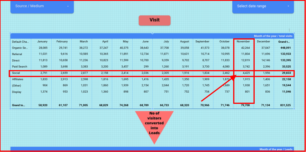
As depicted above in the picture, the users in the “social” channel almost doubled in the month of November compared to the rest of the months.
But is the same trend observed in the next stage of the funnel which is Leads?
Like this, there are lots of different methods through which you can evaluate any specialized data and make appropriate decisions.
Remember we have created 3 different segments. This is the time where we need to use those segments.
- Visitors Segment
- Leads Segment
- Converted Visitors Segment
In this funnel template, there are three pivot tables. You need to add these segments to those tables.
Steps to add segments to the pivot tables
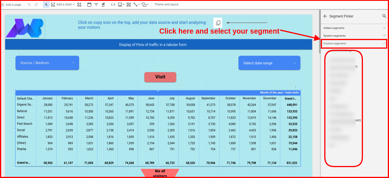
- Select the first table and click on add segment filter available in the right editing panel
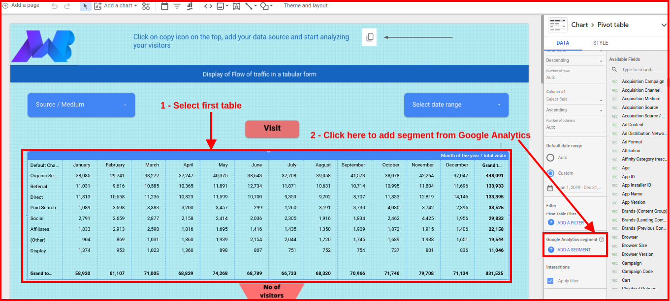
- Then click the custom segment and select the segment you created in Google Analytics.
- Follow the same process in the remaining two tables.
Now after segmenting all the three tables, you can analyze the data according to the funnel report.
Note – You can build your own segments depending on your requirements and incorporate them into this template. Please mention in the comments if you have any other suggestions for coverage.
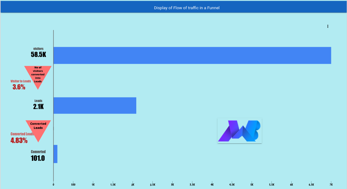
User Funnel
Funnel analysis is a method of understanding the steps required to reach an outcome on a website and analyzing how many users get through each of those steps. A typical funnel chart like the one below transforms this data and makes it easier to visualize how many users are getting through each stage in the funnel.
Funnel analysis is a very powerful tool to help you understand where your users are dropping off on their path to conversion.
This Google Data Studio funnel template consists of three layers:
- Total no of the visitors engaged
- No of the visitors turned into leads
- No of the leads which convert into customers
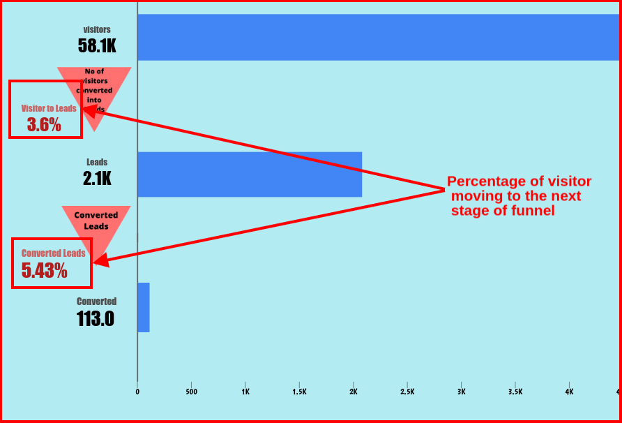
You can also analyze the percentage of visitors moving to the next funnel by the scorecard on the left side of the funnel.
Again you need to add segments to sort the data as we did in the case of pivot table earlier.
There are some important points you need to focus on while adding segments in this funnel.
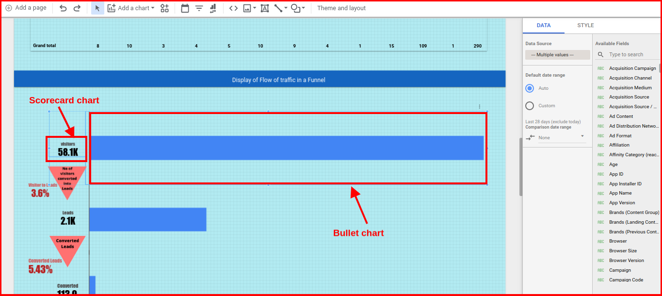
We need to select both the charts in a single layer i.e. a scorecard chart and a bullet chart so that when selecting different data ranges, both display the same data.
You need to follow the same process with other layers in the funnel and your funnel is ready to monitor.
Tricky Portion
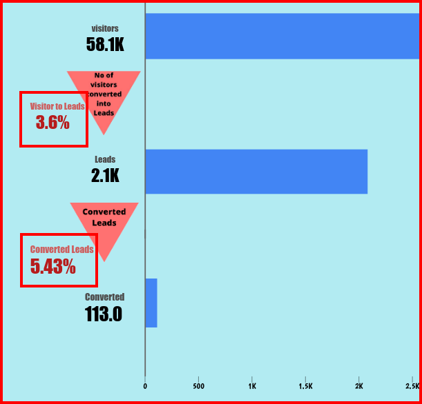
In the image above we can see the percent of the visitors moving to the next stage of the funnel. This is a bit tricky to implement. To solve this, I have used a data blending technique.
We know that all three scorecards are the same. We have just renamed them and used the segment to filter them.
You can’t calculate the difference between two entities or metrics because they are the same value. Even a 5th-grade Maths student can tell you that.
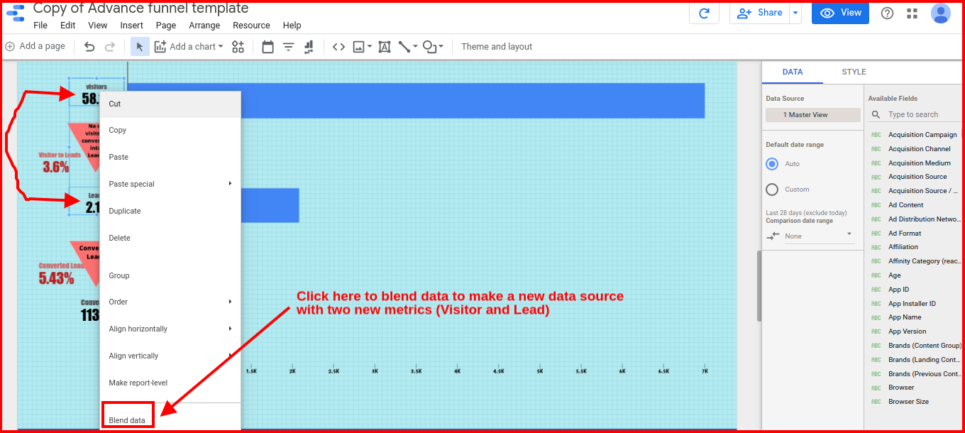
To solve this, you need to select the 2 same metrics and blend them to make a new data source. This will result in the formation of two new metrics; the difference between these two new metrics can now be easily calculated.
Steps for data blending
- Start with selecting the initial two metrics i.e. Visitors and Leads
- You need to calculate both of them to find the percentage of visitors continuing the flow.
- Right-click and select “Blend Data” option in the menu which appears
- In the right editing panel, you will see a new data source with two different metrics and a new dynamically produced measured metric that displays the percentage of visitors.
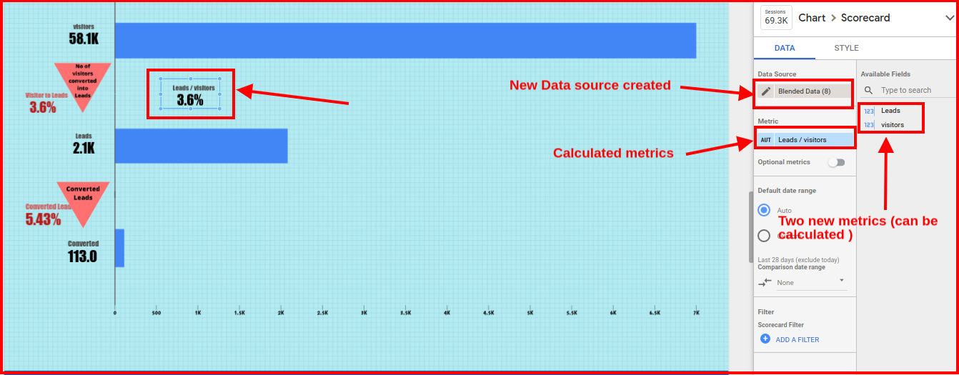
- You have to follow the same process for the next two metrics which are Leads and Converted.
Note*- While copying the data you will see that you have to connect three data sources. One will be your main data source (Google Analytics) and the next two will be the new data sources that are created for the above metrics. At this time select only the main data source because the other two data sources do not exist for you at the moment, as those data sources are created dynamically only when you start data blending.
Still facing any difficulties in any of the processes I have explained in this article, you can comment or connect with me.
Summary
Channels are the most important aspect to increase the chances of your market refinement. So, failing to track critical channels could lead you down a blind alley and you end up not knowing what’s going to hit you next.
This Google Data Studio funnel reporting template will provide you with essential insights into what is actually happening in your channel. But you need to correlate the first layer of visitors with the rest two layers in order to understand the impact of each of these metrics on overall results.
Check out other blogs on amazing Google Data Studio reporting.
Comment and share your ideas or thoughts in the comment section below. We’ll appreciate that


An excellent article again. I was so impressed to read about the funnel analysis. It is awesome to learn how to perform well.
Thanks Reena, one of the best approaches to understand the market is certainly funnel analysis.
This is Very Detail Guide On Funnel ever we seen , you have mention each & every details on Funnel analysis, It Really Help people lot to improve website Ranking on SERP’s
Thanks Affiniq