Pop-Up Forms! What do you think about them? Well, I have gone through various posts related to pop-up forms. Stating pop-ups are annoying and irritating. But in my observation pop-up forms are one of the best marketing approaches that can capture lead information for further nurturing.
The average conversion rate of top-performing pop-up forms is 9.28%. So, it won’t be right to say, pop-ups don’t work and they’re annoying!
But if your thinking about pop-up forms isn’t good then join me in this pop-up venture. I’ll be traversing the reasons that will compel you to create engaging pop-up forms for your business too! So, let’s begin this pop-up guide with the question- what are pop-up forms?
What Are Pop-Up Forms?
Pop-up forms are lead capturing forms as they help in acquiring lead information for converting the visitor into a customer. Pop-up forms appear at the moment specified by the marketer and try to entice the visitor with offers. These types of forms, pop-ups on the screen of users and thus termed as pop-up forms/pop-up boxes. They can pop up at any moment during the active session of the user on the web page.
A pop-up box is a combination of content, design, offers, CTA, and fields to fill. The main objective of this form is to acquire as much information about visitors as it can to improve business results. These forms can be activated on any web page of an online store to attract visitors’.
You can easily find tools for creating engaging pop-up forms like MailChimp and HubSpot. The pop-up forms created by them are fully customizable and fascinating in appearance. For instance, the pop-up forms of HubSpot are available in four types i.e pop-up box, drop-down banner, slide-in box left, and slide-in box right. Adding they also enable to
- Add CTA button
- Add converting content and offers
- Create follow-up emails
- Select pop-up appearance time
- Preview and change accordingly before publishing
- And much more…
To know in-depth on how to create engaging pop-up forms through HubSpot go through the blog “Creating an Effective and Engaging Pop-Up Form”.
After knowing what are pop-up forms, now let’s explore why marketers need to add pop-up forms on their website! So, why pop-up?
What Is The Purpose Of The Pop-Up Forms?
The purpose of a pop-up is to attract and gain information. If a pop-up is failing to do so, it doesn’t mean pop-up forms don’t work! The thing is successful pop-up forms require creativity. You’ve heard people saying that pop-ups are irritating and sites shouldn’t practice them. This isn’t right!
When a visitor lands on a page, he looks for information that can help him. If he finds value on your site, they search for things through which they can reach you or you can contact them back. Pop-up forms help those searchers by letting them provide their information for further nurturing.
You would be losing your potential leads if they don’t find any interaction medium to reach you back. Pop-ups aren’t present to irritate your clients, but for clearing the path for nurturing and making your business grow. Using the pop-ups, you can
- Capture Users’ Attention
- Provide A Painless User Experience
- Maintain Users’ Engagement
- Increase Sales And Revenue
- Boost Subscription Rate
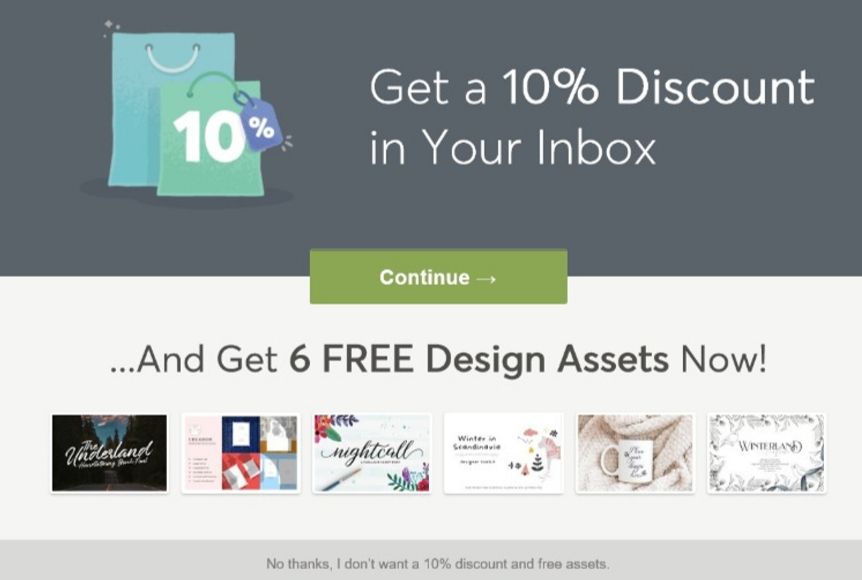
Pop-ups don’t frustrate, the wrong implementation irks! Here is a good example that can clear the difference between creative pop-ups and painful.
Example Of A Wrong Pop-Up Form
Source: https://confirmshaming.tumblr.com/
After seeing this pop-up I am still confused about what they are offering! They are saying get a 10% discount in your inbox. But the thing is, what type of discount and on what? Basically they have forgotten to mention the main thing.
Adding to this, they are offering two offers at a time. The rule of pop-up says, highlight only one offer at a time to reduce the occurrence of confusion. Even their CTA isn’t clear to understand. This is the right example to show why pop-ups are bad for a few marketers!
Example Of Working Pop-Up Form
Source: https://confirmshaming.tumblr.com/
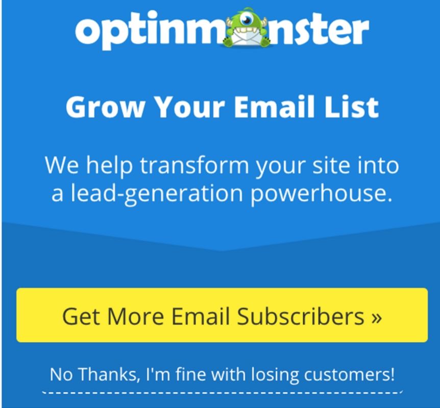
Are pop-ups bad? No. Optinmonster again brings our faith in pop-up forms. The pop-up form of optinmonster is clear to understand and phenomenal. They have clearly mentioned what you’ll acquire if you sign-up and become their subscribers. Including the logo in pop-up forms was an awesome trick!
They have everything. A logo, motto, clear call to action, and the line no thanks, I’m fine with losing customers was something you can’t ignore.
After seeing the difference, don’t miss the pop-up best practices that can make your pop-up form more flourishing. So, let’s check out how you can put pop-ups on your website!
Best Practices To Create Engaging Pop-Up Forms
1. Create Pop-Up According To Your Target Audience
Audience segmentation is always the first responsibility before implementing any strategy. For this, you need to prepare a demographic list containing all basic questions about your target audience. It can be their gender, age, location, profession, educational qualities, hobbies, and much more. Segment your audience based on the demographic details you’ve occupied.
For instance, you run an online restaurant. You’ve planned to provide a discount of 20% on south Indian dishes to make some profit. And display it on the pop-up form. But, this offer has nothing to do with the people of north Indians. If you make this offer specific to south Indians there’ll be a great opportunity to convert. But not for north Indians.
That’s why you need to segment and create pop-ups according to your audience. The same pop-up for every group won’t wrong. For instance, if your target group lives in US and India you can’t provide the same content, offer, and design to them. Therefore, you need to personalize your pop-ups and craft according to your audience’s requirements.
2. Pay Attention To Pop-Up Design & UI
If your pop-up form isn’t appealing in look forget that it would ever work for you! The design and color scheme you choose for your forms are equally important as segmenting your audience.
Your pop-up form design and color should match your website color theme. Your forms should give the feel and appearance of your online store. Check out Pinterest and other websites to get an idea about the designing part of your forms. Include soothing colors and check the UI of your design before making it live.
If required, you can even consult an agency that can help you to create engaging pop-up forms. We also provide eCommerce designing solutions. Let us know if we can help you in any way!
3. Trigger Pop-Up At The Right Time
In lead conversion, timing plays a crucial part. If you trigger your audience at the right moment the chance to acquire details about them automatically increases. For this, you need to specify the time after which the pop-up will appear on visitors’ screen. It can be after 20 seconds, 50 seconds or any time during his active session on your site.
To create engaging pop-up forms, you need to pay special attention to two things. First, you can’t offer a pop-up the moment visitor opens your page. Second, the pop-up shouldn’t appear too late. For grabbing visitor’s attention you need to pick the right time for your pop-up entry. The secret behind the best email pop-ups is that they trigger at the right moment. So, be attentive while selecting your pop-up entry time.
4. Pop-Up Content Should Be Engaging
Content with the right context is the next thing that you need to make your pop-up converting. The thing with pop-ups is that you can’t create as much as you want. Your words become restricted with your form size. In a limited area, you’ve to create an engaging line with CTA and offer.
Be smart with your words as it can increase the lead conversion rate of your business. Therefore, create less but with more effective words.
5. Use Opt-In Options
Make your pop-up forms more successful with the implementation of opt-in options. There are two types of opt-in options that can be practiced to acquire the email address of visitors.
Double Opt-In Option- In this, visitors are required to provide their information and confirm their subscription before joining your database. It can be termed as a two-step process as it requires users’ confirmation before any further activity. The plus point of opt-in option is that only those users are added to your list who are really interested in your business.
Single Opt-In Option- This is a one-step process as it eliminates the confirmation step required in the first opt-in option. Users only need to enter their details to become a part of your contact list. The only disadvantage with the single opt-in option is that you won’t acquire qualified leads in your CRM.
Choose any of these options to create engaging pop-up forms. Click here to know more about opt-in options.
6. Generate Scarcity By Including Offers
What attracts visitors’ the most? Of Course Offers! Nothing can entice a user more than a discount on his favorite stuff. We have real-life examples that clearly show that offers are the best gift that a business can give his users to make himself happy. It’s just like becoming clever to gain profit. But it’s the reality of online marketing, we have to accept it. Let’s don’t dig the unfruitful facts of marketers. So, I was talking about the real-life examples, for now, let’s concentrate only on that.
Amazon is the world’s largest company by revenue who doesn’t know this? Even kids know what is the use of Amazon! Every year Amazon runs exciting offers during the holiday season. In bulk users’ shop to have their desired product at minimum cost.
Users find it pocket-friendly and thus it helped Amazon to register himself in the list of top companies. Not only in the holiday season but they also run offers the whole year. From this example, the benefit of offers is crystal clear.
If you want to make your pop-ups more effective, you have to include offers on it. You simply can’t overlook the power of offers!
In your pop-up form show your customers the profit they’ll acquire if they become a part of your business. Practice this approach to gain potential leads. Just look at this to know what I am talking about!
7. Provide One Offer At A Time
Don’t confuse your users’ by displaying more than one offer. Pay attention to one offer to maximize your output. If you include too many offers in your pop-up forms it won’t look good, it’ll confuse your audience, plus it won’t leave a good impression of your business.
For displaying all offers sites holds an offer page. So, it would be highly recommended to avoid the practice of too many offers on your pop-up forms.
You can provide an offer on blog subscription, mail subscription, downloadable content, and much more. But focus on one at a time. Your offers can vary to page-to-page. For instance, if you offer 20% to your blog subscribers on the blog page. It would be absolutely fine. The only thing to remember is don’t confuse your visitors by displaying too many offers.
8. Include Minimum Fields To Fill
Users want painless experience. Long-forms and fields just irk them. Even the site abandonment rate increases if users’ find too many fields to fill. You simply can’t afford to lose your potential lead. You ‘re practicing infinite things to gain information through pop-ups.
Your long sign-up forms will be enough to make your visitors run away from your store! Include only those fields that are necessary plus your users don’t hesitate to fill. Industries vary on various parameters. Every business has its own requirements. You have to decide the fields that are essential and can’t be ignored in any condition! Pop-up forms are an effective way to generate email leads and add subscribers to your contact list.
9. Include Creativity
What makes you unique from others?
The creativity that you include in your work! Creativity doesn’t mean you have to pick up your brush and start painting the canvas with colors.
Creativity in marketing means the implementation of new ideas and technologies. If you aren’t experimenting with your strategies, you can’t survive this competitive market.
Your forms should be creative and engaging enough such that your visitors can’t roll out their eyes from it. Animation in forms also works.
Check out the Kinsta newsletter subscription form. They are the perfect example to show how to create engaging pop-up forms. This can be termed as a best practice for creating a beautiful pop‑up form for your business.
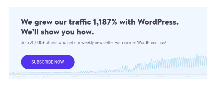
On the click of the subscribe now button the pop-up rotates and a subscription form appears on the screen. In this form users only need to provide their email address in order to enjoy subscribers’ facilities.
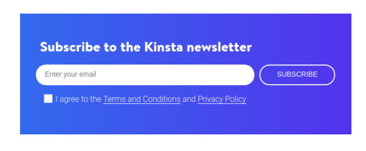
Make your pop-up form design according to your website theme and motto. Especially the color palette is what you really need to focus on! Just like Kinsta.
Use your pop-up forms for branding by including your brand logo. With this, online users’ can easily distinguish your brands’ logo from others. This will give your logo a new life and energy. Pop-up forms can improvise your customer list. Keep experimenting with your forms to know exactly what works for your business.
10. Make It Mobile-friendly
Your pop-up forms don’t work because they aren’t optimized according to devices. Users not only operate desktops for their work and search. But, there is a large group of audience that now prefers to browse on mobile rather than desktops. And trust me, the search rate on mobile devices isn’t measurable to any other devices.
Create engaging pop-up forms that are mobile-optimized to increase your reach and convert your target audience. Use tools that can determine the performance of your pop-ups on mobile devices. Make your pop-ups mobile-friendly to register it into the list of successful pop-up form.
11. Create A Follow-Up Campaign
Your visitors’ have given you their email address and other information that you needed for lead nurturing. But what next? How will you nurture your leads? Do you have plans for that? And ever thought about this?
Your goal isn’t to acquire email addresses. You have tried to create engaging pop-up forms to nurture your leads and convert them into your business customers. All your efforts will go in vain if you don’t strategize your next step.
Therefore to make your pop-up forms more engaging you need to create the follow-up campaign. Prepare a flowchart for your email campaign. This will help you know the step by step procedure of your campaign. With this, you would be having a clear image of your activities and your next step.
Moreover, you won’t get blocked by your users as you would be knowing the time, you need to send your follow-up email. Learn how to carefully run pop-up campaigns to make your follow-up campaign successful.
12. Test Your Pop-Up Before Making It Live
Now comes the step that you simply can’t overlook. Because you don’t want to create unfavorable situations for your business. So, the thing you need to do is perform A/B testing of your pop-up forms before making them live.
You can’t afford to go wrong. Therefore you need to check each and everything to make sure your pop-up forms are perfect. Here is a checklist to ensure the quality of pop-ups-
- Check your content
- Your offer
- The CTA button
- Designing and color
- Mobile-friendliness
- Working of opt-in options
- Form of your pop-up
- Pop-up trigger time
This is the list. Check and cross-check all these parameters to maintain your pop-up responsiveness. Preview and test your pop-ups. As your pop-ups aren’t live, you can still do experiments with your forms to make it according to your specifications. This A/B testing of your forms will help you acquire better results for your business.
13. Analyze Your Pop-Up Performance
Here comes the final step in your journey to create engaging pop-up forms. Here you have to identify what you have achieved and what you can do to make your results better!
Check out the engagement rate of your pop-up forms by determining the number of email addresses you’ve obtained. How much click-through rate your forms have gained in a specific time-interval or campaign. How much your offers have been utilized? Which opt-in option are your visitors preferring the most? Is your pop-up triggering at the right moment or it’s just going to waste? And what your analytics data speak about your pop-up forms?
Keep analyzing the performance of your forms to gain perfection!
Extra Pop-Up Tip: Maintain Your Audience’s Trust
Visitors provide their personal information with the hope that you don’t break their trust and never miss use it. When businesses use visitors’ information to promote and market their products they break the bond that has just started growing between them.
Visitors have given their details because they want useful information from your site that can help them to achieve some desired goal. But if you purposely try to impose stuff on them you would simply gonna lose them forever!
That’s why if you don’t want to degrade your contact list maintain your audience trust. Provide only that information for which they have provided you their email address. Don’t try to become smart with your currently acquired lead that has high potential to convert into your business customer. Here are some more things that you need to remember while creating your engaging pop-up forms- To Know How To Use Pop-ups Correctly!
- Don’t make it too difficult to close the pop-up
- Don’t include too many redirects
- Include different types of pop-ups for each page
- Clear the purpose of the pop-up form
- Use the Right Format in pop-ups
- The pop-up form should highlight only one offer
- Include a clear call to action
- Create the follow-up campaign
- Enter your pop-up at the right time
- Avoid the implementation of full-page pop-ups
Over To You!
Pop-ups are just like the relationship without which you can’t live! People keep on saying leave them. But you know the reality and know-how important they’re for you!
Well, I would say don’t listen to them. Your marketing needs the implementation of pop-up forms to increase your contact list. I have mentioned the best practices that can help you create engaging pop-up forms for your business. Go through these best practices for creating a beautiful pop‑up form and let us know your opinion about this post. We would love to hear your words.
We provide solutions to all online businesses in WordPress/WooCommerce and digital marketing. Let us know if we can help you in achieving your business goal in any possible way!

