Customers are drenched with marketing information every day. There is a constant bombardment of videos, images, and texts, promising solutions to every other problem. This results in a lot of confusion. A confused and overwhelmed reader is less likely to turn into a customer.
So here’s the solution…
Using a CTA will help resolve issues. It can turn out to be a perfect way of flaunting your latest assignments. It helps and supports decision weariness and gives meaning to your matter. Also will create interest and will be a highlight on a particular page of content. If created properly, customers will not be able to help but click on them.
What is a Call-to-Action Button?
Call-to-action buttons also termed as CTAs, are the buttons that can be used on a website and on the landing pages to attract users towards the goal conversion. Call-to-Action buttons are provided for the users to take immediate action. It is commonly written as a command or action phrase. Call-to-action buttons can propel a variety of actions relating to a content’s objective.
The most known way of call-to-action implementation on web interfaces is in the form of clickable buttons. These buttons, when clicked, perform an action or lead to a web page with additional information that suggests the user take action.
This simple button will tell your prospective client what to do exactly and where to proceed next. An effective call-to-action button will wipe out the confusion. It will allow your website visitor to take further steps. That can be a visit to a particular page, booking a call, or reading a specific blog.
Call-to-Action Buttons for Social Media
Social media largely focuses on and is all about getting users to click on your posts. It puts an emphasis on reaching people and tempting them towards your ads, ideas, etc. It offers too many things to brands and customers. Therefore, your marketing strategy should be such that it compels people to turn into your customers.
The simplest way is to use a call-to-action button. Adding call-to-action buttons increases conversion rates to a great extent. But it is not as easy as it sounds. A good compelling CTA can help you get recognized and identified.
Often, there is pressure to create new and crisp content, in the form of videos, blog posts, etc. Update content is crucial, but it also needs to serve a purpose. By linking a good call-to-action button to your content
The following points will help you create an effective call-to-action button that will grab the user’s attention and tempt them to click.
Best Practices to Create Compelling Call-to-Action Buttons, Increasing CTR & Conversions
1. Persuasive Text
The best call-to-action buttons are those that grab the attention of the user. An effective strategy to succeed in this would be making use of a bright color button that contrasts with the color of the page or an email. Call-to-action buttons should present noticeable, action-oriented text. Less intriguing words like ‘submit’, ‘enter’, should be replaced with action-packed words like ‘grab’, ‘reserve’.

A call-to-action button as the name itself suggests should be designed in a way that the user is compelled to take action. An effective call-to-action button should make use of words like ‘discover’, ‘grab now’, etc.
2. Visibility of the Call-to-Action Button
The Call-to-action button should be the most noticeable thing on the page. The font size should be large and legible to grab attention, but not so large that it becomes distracting or intimidating.

Your call-to-action button should be pleasing to the eye. Also, it should not be such that it overpowers the content on the rest of the page.
3. State the Benefit
Speaking about a benefit that the user will get from using the call-to-action button will make them more likely to click on it. Typing an additional line of information along with your call-to-action button text can be a good option to rely on.
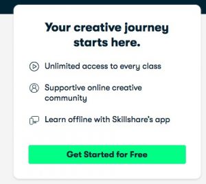
This is very familiar with free trial buttons. For instance, a free trial button might say “30-day trial, no debit card” in a comparatively smaller text underneath the main action-packed text. This will give the users a little piece of the necessary information and might encourage them to click on the call-to-action button.
4. Urge the users
Creating a sense of urgency by using phrases such as limited-time deals will make users take action and get them to click on your call-to-action button.
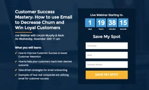
5. Design of the Call-to-action
Using small arrows or graphics on your call-to-action buttons can positively affect the click-through rate. While making use of graphics be sure that you clarify your message rather than distracting the users.
The call-to-action buttons should be appropriately placed so that they align with a user’s experience. For instance, put a ‘sign up’ call-to-action button at a place where the user reaches after having read your entire offer. The call-to-action button placed at an area where the user reaches before reading about the whole offer will make it irrelevant as the user lacks knowledge at that point.
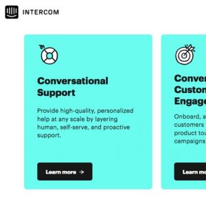
The shape of the call-to-action button is also a vital part of the whole process. You can go for a more rounded button shape or a sharp-edged one. Both the styles perform well and it depends on the entire setting. You will have to figure out what works best for your website.
6. Pay Heed to the White Space
The call-to-action button should always be surrounded by a good white area. The white space highlights the call-to-action button which helps attract the user’s attention and helps the button stand out from the rest of the text on the page.
7. Tone
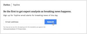
The web is full of information and your customers can easily get distracted. It is of utmost importance to grab their attention, guide them through the procedures of signing up, shopping on your website, and selecting your product.
If you want a proper engagement or conversation, try using phrases like, ‘We’d love to hear from you’, or ‘Join this community’.
In case you want to make your customers aware of a discount, you can go for phrases like ‘Don’t Miss It’. This will instill a sense of urgency and the customer might click on your call-to-action button.

If you want to narrate a story or give important information, you can try adding a piece of a quote from that content with a ‘Read More’.
8. Goals
Before creating your call-to-action button, think about what action, in particular, you are trying to get done from your customers. Your sales, marketing, and social media team will have to work together as a team in order for things to pan out as planned.
For example, your posts will generate engagement like:
- Motivating user-generated content
- Bringing in conversation and comments
- Bringing in sales and sign-ups to your landing page
- Make users aware of discounts and sales
And much more…
The call-to-action button can be decided by keeping these above points in mind. You can also use social media reporting tools to examine and track your social media posts that lead to the kind of interaction you’re investing in. This way you can adjust your social media marketing strategy as you expand.
Types of Call-to-Action Buttons
A call-to-action button, or CTA, prompts readers to take a particular action or visit a certain page. The following types of CTA’s serve the same purpose but through different methods. It helps to increase visibility and profit.
Leads
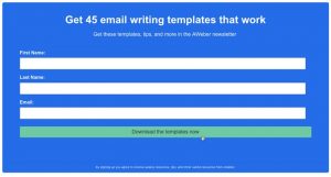
This type of call-to-action button focuses on converting visitors into buyers. Since not every client wills to buy, these CTA’s can provide additional offers to users who aren’t ready to buy.
Want to Know More About Generating Leads?
Check out this article to know more about the odds and ends of leads.
Form Submission
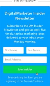
Form submission can convert unknown visitors into recognizable leads. This CTA focuses on getting the users to submit online forms. Using first-person language, for example, “me” and “my” can evoke a sense of ownership of your offer to the customers. Since doing this might make them feel that this offer was made especially for them, the chances of them filling the form can increase.
Service or Product
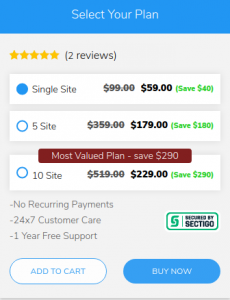
These are the most common to be found on websites. They guide visitors to products or services offered by the companies. Here’s an example of a product on MakeWebBetter.
Share
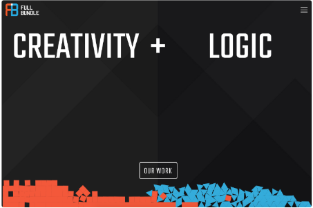
It’s important for companies to showcase their work. Reaching their target audience is a crucial step. This call-to-action button compels visitors to share your content across social media channels. Which, in turn, helps improve your online presence.
Source – FullBundle
Read
A read or learn more button motivates readers to continue reading your content. This CTA simply allows the user to know and explore more about the business, the work they do, and the kind of services they provide to their customers.

Source – Impact
Promoter
Events are nothing without participants. Companies use this CTA to promote their products and services. Therefore, this call-to-action button helps users to learn about products and register for events or promotions.
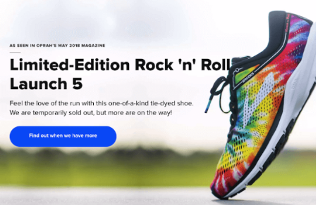
Source – HubSpot
Sales
The end goal of all the companies is closing sales. This call-to-action button urges the visitor to conclude their business eliminating the problems of sales.
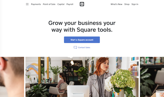
Source: Square
Selecting which call-to-action button to use and where to use it is an important part of choosing a particular type of CTA. It depends on both your audience as well as your business’s needs and requirements. Are you aware of what your customers want to listen to at the moment? Do you know of the things that encourage them during these times? Make sure you know the answers to these questions. You should very well know not only where you want to lead your site but also where your target audience wants to be taken next.
Call-to-Action Buttons Can Improve Your Conversion Rates…
Improving the performance of your website often results in increasing conversion rates. Effective call-to-action buttons in these particular areas, give rise to a larger extent of success than expected. For a business:
- Call-to-action buttons on landing pages increase conversion rates.
- Revenue increases.
- Website and product sign-up increases.
Speaking about improving the user experience and engagement, a significant element of any website, call-to-action buttons provide the following visitor experience:
- Builds links between a customer’s need and availability.
- Faster access to products and services.
- Increase in usability and customer satisfaction.
- Delivers immediate access to content decreasing a customer’s stress.
How to Measure Call-to-Action Buttons?
Call-to-action buttons can be measured by keeping track of the following:
- Number of views received
- Click-through rates
- Post type
- Positioning of the CTA
Conclusion
Create multiple types of call-to-action buttons to cater to different types of audiences. Think about the lingo you’re using, the aims you have for your posts and campaigns. Who all will benefit from your service and what will help them make the right decision?
A clear call-to-action with a piece of content furthermore clears the intention of the content. With the help of this, the reader isn’t left baffled. Your content builds interest, and your call-to-action button compels the reader to dive deeper into the topic.
Don’t stop marketing after you post. Always analyze your social media posts to keep a check on what’s working for you and your business and what isn’t. This way you will get to know which part of your work needs improvement. Call-to-action buttons serve as a leverage point for your requirements as a business. What stands to most significant to you presently can be turned into a Call-to-action button. From landing pages to social media posts, each piece of content becomes powerful when put across with a CTA.
Let’s Explore CTAs Together!
Come and discuss more about the CTAs and their varied impacts with us and other members of the community.




Hello, Great Article!