The same cliché that says “a picture is worth a thousand words” despite evoking monotony with repeated utterances is still valid and is considered to be a crucial principle for every designer to follow.
When it comes to landing page design, the principle has a bigger and more influential impact. Landing pages need to grab attention quicker to convert leads. This is why the use of befitting images proves to be highly important.
What are the time-tested principles for choosing landing page images?
Let us provide here some of the most important tips and practices that you must keep in mind while creating conversion-centric landing pages.
Also, you should consider using landing page images effectively on the website.
Besides, let us briefly look at some of the key statistics and benchmarks for landing pages.
Key Landing Page Statistics and Benchmarks
When you want to optimize your landing page, the most important thing is knowing the industry benchmarks and relevant statistics. Let’s offer a few of them.
- According to a study by Unbounce, the average rate of conversion for landing pages across all niches stands at 9.7%
- It has been reported by a HubSpot study that businesses relying on more landing pages see at least a 55% hike in generating leads.
- According to Nifty marketing, 86% of the high-performing landing pages are optimized for mobile view and interactions.
These few statistics and benchmarks indicate that landing pages matter for business conversions. If mobile optimization is important for landing page lead generation, images are likely to play a significant role.
It is important to note that you will need to develop a user-friendly website in order to make your landing page stand out!
Landing Pages Vary Widely
Source: semplice.com
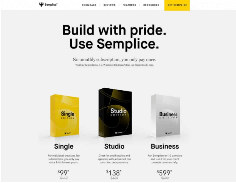
Now that you have understood the importance of landing pages and the way they are mobile optimized by using less text and more visual cues, it is important to understand that landing pages vary widely. They are different as per industry niche, target audience, and respective business objectives.
Turning the target audience to a specific landing page is the key to success for a marketer. There are few approaches to do this effectively. There are five different groups of people who can be targeted with a befitting landing page. Let’s describe them briefly.
- Unaware: Users who are not even aware of their problem.
- Pain-aware: Despite knowing their problem, people do not think that there is an available solution to the problem.
- Solution-aware: People are aware of the available solutions but do not know the solution you can offer.
- Product-aware: People who are already aware of your solution and consider your offering as viable options.
- Most aware: People who, despite being convinced about your solution, are looking for other options in the market.
On the landing page, the above-mentioned description can help you target the right audience with the befitting landing page content.
For example, when the landing page targets the primary types of people who are unaware of the problem and the solution, you need to evoke a sense of pain by comparing it with a scenario where the problem doesn’t persist.
In contrast, when your audience belongs to the last category, your landing page no longer needs to inform them about the product and its use cases. You need to evoke emotions to gain more confidence and customer trust. You only need to convince them that they have made the right choice.
The Technique of Evoking Urgency
Marketers use this technique of creating a sense of urgency on many occasions. This technique is highly effective in reminding the audience about the persistent problem and the solution that is waiting close in hand to provide them permanent relief.
When it boils down to the use of images, think about visual options that can evoke emotional engagement with the pain or problem and the available ways to solve them.
The trick is to engage the users through the emotional content of the image and make them scroll down to find the solutions written with text content.
After taking in this image, the visitor scrolls down and finds more information about their features, the app, and other technical elements of the solution. The target audience who have already gone through a similar situation will instantly understand and know the solution unfolding for them.
Explore More About Urgency Marketing…
Use Hand-drawn Graphics
People while browsing the web generally consume a lot of images and they are already over-served with images of real-life faces and objects. This creates a kind of cognitive fatigue in the perception of the users resulting in decreased engagement. How to beat this challenge with something unique and attention-grabbing?

Source: Freepik.com
Well, we suggest using hand-drawn graphic visuals. They bring a fresh appeal to the landing page design without losing the context. The increasing popularity of emojis and animated figures in design explain how people feel naturally attracted to funny and quirky expressions. The same principle also makes hand-drawn graphics more attractive.
While using hand-drawn graphics in landing page design, remember a few ground principles of graphic design process that we mention below.
- Do not overdo the design elements and keep it minimalistic and crisp.
- Maintain visual consistency and coherence with the overall landing page design and layout.
- Make sure the hand-drawn sketches or digital art convey the right message instantly.
- Make sure the graphics don’t create a lot of visual distractions and cognitive load.
- Maintain the “Colour Psychology” in graphics and use the appropriate shades.
- Don’t use abstractions or surreal elements. Use graphics that intuitively display the right emotion while conveying the message.
The Technique of Showing Fulfilled Expectations
Unlike the previous technique of showcasing a problem and its solutions. This technique mainly draws on showing the customers’ desired outcome or fulfilled expectations. The principle working here focuses on making a positive impact on the audience by showing the desired result.
Almost all decorative items, travel businesses, art products, builders and architects, home furnishing, and interior design brands use this technique in their landing pages. These brands showcase beautiful and engaging images that show the business offerings in a positive light to the target audience. By using this approach, these brands create images that resonate with the audience’s aspirations, reinforcing the appeal and desirability of their products or services.
Make Use of Images for Establishing Trust
Source: Kylethacker
The most stupendous roadblock to any brand selling its products and services online is the deficiency of trust. Just because online shoppers cannot get access to a physical store, the legitimacy and trustworthiness of online businesses remain in question unless they are already established brands.
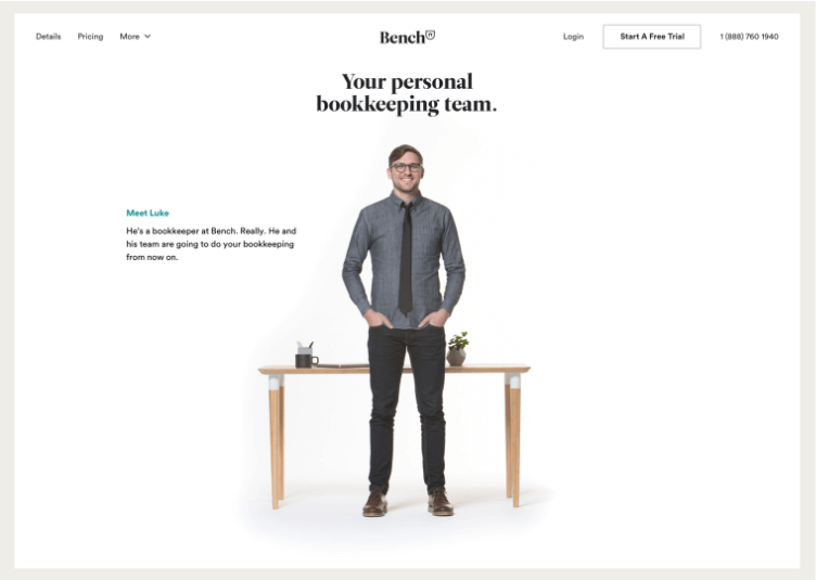
Certain techniques help a business to generate and establish trust in users. User-generated content (UGC) is often cited as the most effective way to generate trust in a brand. Using images showcasing other users with the product in real-life contexts can be very convincing.
There is an increasing trend of using the images of real people in landing pages for the very purpose of invoking trust. Well, all the traditional media ads use this technique. How you can utilize this method by using the images of real customers or company people would depend on your audience, niche, and strategy.
Usually, in B2B scenarios, the images of company people work better. But for consumer products and services, the images of company people are more effective.
Use Visuals With Directional Cues

Source: mdirector
The point of landing page design is to engage the visitors and provoke them to take action. This is where certain images that come with visual cues can be highly effective. These images guide the web visitors where they should look at.
The visual having implicit directional cue can just be an image of someone gazing towards the CTA button of the page. Or the explicit visual cue can be just an arrow pointing towards the CTA button. Each type of visual cue has its respective characteristics and certain important details.
The implicit visual cues are used as micro expressions, the indicative gaze or little facial expression instantly conveying us the direction while interpreting the emotion perfectly.
According to scientific studies on the effect of eye movement, it has been found that people are easily influenced by the movement of eyes or facial expressions. Suppose, in an image, someone is depicted to be gazing at a product with a positive charm. In that case, the same can influence the visitors in forming a positive opinion on the depicted product.
Add Compelling CTAs To Your Landing Pages
The subtle and expressive image that with a facial expression or a gaze directs the audience’s attention towards an actionable button can be tremendously effective in pushing engagement. Such implicit visual cues will make users feel the clicking of the button as a natural step in the course of actions.
When it comes to using explicit directional cues, remember they are more straightforward and should be used sparingly or just in the befitting context. Arrows and graphic illustrations that direct attention to an actionable button can only be used where users are very likely to click on the button.
The visual cue just makes a little push to accelerate the action. Often animated visual cues work doubly as micro-interactions to help users find a button or get informed about the next action in the pipeline.
Bring Emotion Through Infographics
Infographics are popular because of the visually appealing way they present information to the users and instantly deliver the message. The use of infographics remains popular on landing pages if you can convey the message convincingly.
There is no better way to create infographics than adding appropriate visual elements evoking the right emotion. Many designers use infographic tools to design killer landing pages using emotional images.
While the ground principles of infographics design will always stay the same, the presentation of data can be enhanced with the right use of colors and some graphic figures to deliver the right mix of relevant information and emotional appeal.
For example, in an infographic depicting a comparison between traditional logistics and smart logistics solutions, a human figure with an unsatisfied gesture can point towards the demerits of the traditional system, while the same figure with a cheerful expression can point towards the merits of the smart logistics solution.
In such an infographic, while presenting the raw data corresponding to merits and demerits, the contrasting expressions of the graphic figure will create the right perception and help convey the differences clearly to the users.
Avoid Using Stock Photos
According to several studies on websites, visitors give attention to the visual and other assets and evaluate the brand by the money spent on website assets and design attributes. This also turns on the user’s trust easily. This is why it is important to invest in quality images for your landing pages.
A key sign of a poorly designed website is the presence of stock photos that are encountered by us often across online platforms. This also pulls down the reputation and trustworthiness of the business brand.
Can’t you invest in quality photography exclusively for the website and the landing page? Well, in that case always avoid using images that are often seen across platforms. It is advisable to carry out a background audit of the image by using Google Images so that you can be sure that you are not using a visual too common.
Display People’s Emotion
Human beings are more positively attracted to human emotions than to other objects and materials.
Human beings are more positively attracted to human emotions than to other objects and materials. This is why incorporating images of people on the landing page is so effective. But while showing human faces, the emotion should speak out through the images just because emotional expressions are contagious and can easily influence visitors.
Many superb web landing pages make use of these techniques and offer a very articulated and user-focused experience. While talking of developers, some companies show their in-house web development team in the real workplace environment, while talking of delivery boys shows the real images of delivery agents with their commute and working gears.
There is no steadfast rule that images of people can only invoke emotions. There are other ways to make the visitors feel emotionally content. A simple visual representation of a product with a breakdown of all the advantages shown in images can also be very effective as a technique.
Don’t Forget the Emotional Impact of Colors
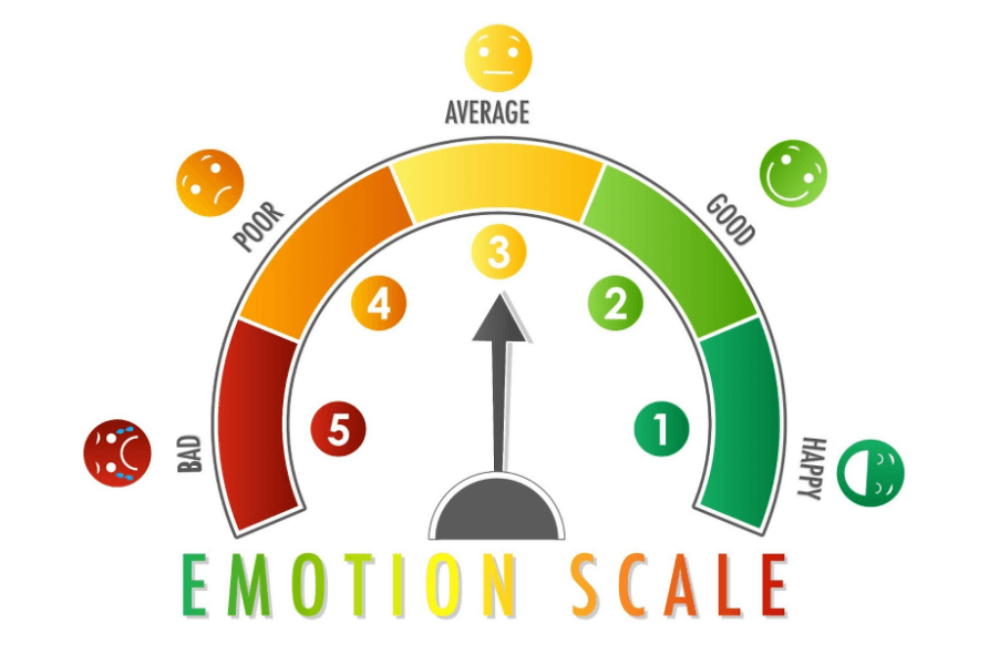
Source: Freepik
There is no dearth of guides for using the psychological effects of colors in the design to help business conversion and user engagement over the internet. There is the over-simplified notion of considering each color’s impact to be the same on every individual. But this is not the case.
Colors always have a profound emotional impact when used appropriately with the images on landing pages. However, 3 distinct elements make this impact possible. Let’s explain each of them separately.
- Emotion: The perception of color air in a particular shade may also depend on the previous experiences and emotional residue left within us. For example, the “red” color for many signifies energy and for many others, it can only refer to “violence”.
- Symbolic: Certain colors are also associated symbolically with particular objects, and hence their uses can instantly invoke psychological effects resulting from these objects. For example, green can refer to grass, and blue can refer to the sky or ocean.
- Culture: Lastly, every color comes with a specific cultural significance that varies from one region to another or from one ethnic group of people. For instance, “white” is the color of purity and cleanliness as per Western culture. While the same color refers to death, demise, and resulting sadness.
This is why for using colors appropriately to make the right psychological impact on the audience, it is important to get a comprehensive understanding of the target audience, their cultural background, demographic attributes, traditions, etc.
Conclusion
So, you have found that so-called images are not just images, but they carry immense weight in conveying the right message and converting leads consistently. As every business focuses on evoking emotions to establish a lasting relationship with the customer, you need to be very meticulous in picking the right images that go well with your landing page.

