The recent COVID-19 outbreak had a huge impact on customers in 2020. It completely changed buying behavior. In order to adapt to the new normal and protect themselves from catching the virus, shoppers have shifted towards online shopping. There was a 12% growth in time spent with digital, more than any other media.
All this means eCommerce is a huge opportunity to generate some hefty revenues in the coming years. But this can only happen when your online store is promising enough to influence the shoppers to buy from you.
It is true that eCommerce is a profitable industry. The purchase decisions of customers in eCommerce are instant. As a business owner, you just have to convince the buyer with a promising product and flawless customer services. Thus Herein comes the role of an engaging eCommerce product page.
What is an Ecommerce Product Page?
In the simplest form, an eCommerce product page is a page on an eCommerce website that describes a particular product or service that the brand is selling.
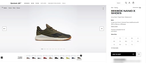
With the help of product pages, you can convey important information like price, features, specifications, and descriptions that encourage purchase decisions. Unlike an article or a blog page, a product page uses a few words that are enough to describe an item.
In short, an eCommerce product page is a page with convincing literature (for encouraging buying decisions) topped with a strong call to action.
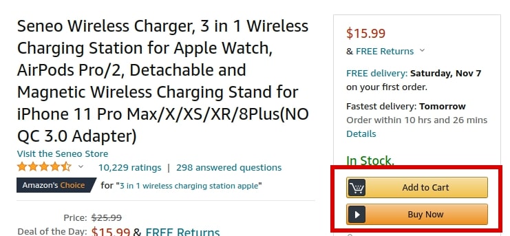
The moral of the story, product pages are the make or break factor of your eCommerce conversions. Your online store pages should clear even the slightest doubts of the shopper to increase your online sales.
In this article, I’ll be sharing with you some timeless and most importantly simple tips for eCommerce tips to improve sales. With these small tweaks, I’m sure you’ll see a significant increase in your profits.
Ready to scale up your eCommerce revenues, let’s begin:
1. Start With Details That Matter
In the fast-moving world, people demand quick answers to their questions. Then, why make your audience have to deal with the hard work of finding important information?
Instead of making your audience dig into the details, start clearly with data like what the product is about and how it can add value.
As an eCommerce store owner, you might have a number of important product details to cover on a single page, but never take the risk of keeping potential customers in suspense; it takes a single click of the back button and you might lose a sale.
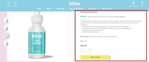
So above is a perfect example of an online product page by Bliss.
They have cleverly used the words and provided filtered information about the product that is short yet complete. In just a single paragraph, Bliss tells its audience what is the product, what benefits it has, and how the product can add value to their lives?
If you want to add even more information to your product, add sections like “At A Glance” or “More Information.” If the customer wants to read something extra other than the features, specifications, and price they can view under these sections.
2. Address The Inherent Motivation For Buying A Product
So while deciding what to consider for your product page, do not forget to address customers’ concerns. Every product comes with an inherent motivation that encourages the purchase of your article.
Let’s understand from the example of HubSpot Integration For WooCommerce.
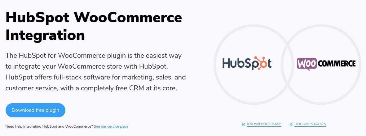
WooCommerce is an open-source eCommerce platform by WordPress that lets you build a fully customizable online store on the way. On the other hand, HubSpot is a complete marketing, sales, and service software. It offers a CRM platform that has tools for increasing leads, accelerating sales, and streamlining customer services.
We wanted a solution that can combine both these powerful platforms and give full control over the eCommerce store business data.
The HubSpot Integration for WooCommerce addresses the need for a solution that synchronizes and automates the WooCommerce data into HubSpot. It not only saves time but also shows all the eCommerce data in one place.
For making some product a best seller, it has to address customers’ concerns. In your eCommerce product page content, add words that motivate customers to buy your product.
3. Add A Distinct Call-To-Action (CTA)
How can we forget the most important part of the eCommerce product page optimization process?
Yes, you got it right.
I’m talking about call-to-actions (CTAs).
A distinct design that is not overpowered by the other page elements is important for making the buying experience simple and user-friendly. The design of a CTA should be such that it is impossible to be missed.
For example – Vermilyea Pelle has a product page that is sleek and minimalistic which highlights the product without compromising the “Add To Cart” button.
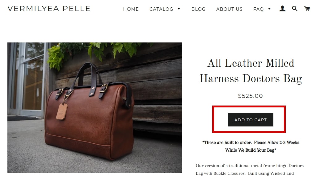
The CTA in Vermilyea Pelle is placed on top of the product description. With a simple design and easy to understand the message, they have made it easy for shoppers to find the way to checkout.
Remember with your CTAs, it is very highly recommended that you are brief and keep the message simple. Also for making the CTAs effective, it has to stand out against every other thing on your page.
Pro Tips: Make use of plenty of white spaces around your call-to-action.
4. Add Visual Elements To Your Page
So one of the biggest downsides of online shopping is not being able to physically touch and examine the product. Due to this reason, it is very necessary to complement your product page with graphics like images, videos, and GIFs in order to provide a better shopping experience.
With the correct usage of visuals, you can bridge the gap between physical experience and online shopping. Let us understand the importance of graphics on eCommerce product pages with an example:
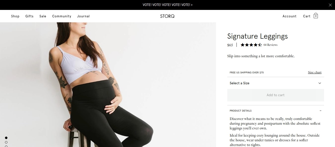
Storq is a brand that sells maternity clothing and emphasizes its soft and comfortable material using their copy and most importantly using visuals. So the moral of the story visuals is not just limited to photography instead, it should answer all the questions and concerns in your customers’ minds.
Actually, the customers should be able to relate to the product features when they see its image.
Visuals on your eCommerce product page can be more than just static images.
Just look at how KeySmart uses short videos on its product page for giving a 360-degree view of the product.
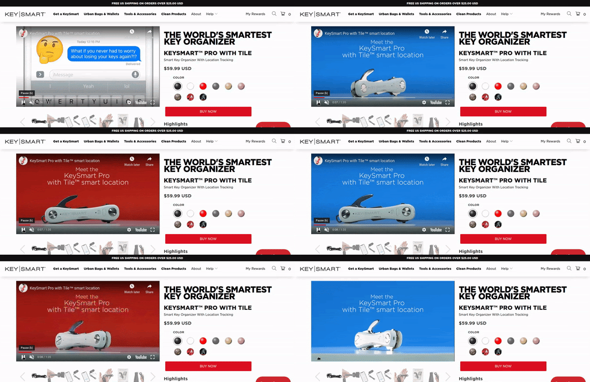
With help of a simple short video, KeySmart flaunts their product in ways a still image can’t do. This has helped KeySmart in making the customers’ experience of how the product will physically look.
Note: You can check this article on how to better your sales pitch with videos.
The product photos and videos can be of great help for promoting the product offsite too. Wherever your products go, the graphics will follow thus, making it worth investing in good visuals for product pages. Thus, while making changes to your eCommerce product page, do not forget the visuals; it is important if your goal is to improve sales.
5. Use For Customer Reviews And Testimonials
Believe me, the only way to increase sales is by making customers believe that your products are valuable. Well, the first approach is through your product page copy. To make your copy even more effective, you need the second approach – customer reviews and testimonials.
Did you know 95% of shoppers read reviews before making a purchase?
The purchase likelihood for a product becomes 270% greeted by just adding 5 reviews.
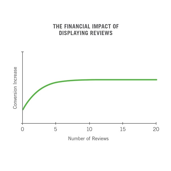
So, the moral of the story is reviews, ratings, and testimonials are important data as it heavily influences the shopper’s purchase decision. Now the problem is customer reviews is a very common approach, look for ways that portray them in a manner that instantly grabs attention.
We can take the example of Amazon for instance. Amazon places the star rating of the product just below the title of the page. Although it shows only two things: the customer rating and the number of reviews. But only these two pieces of information allow the customer to make a quick judgment.
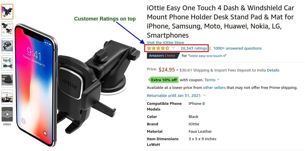
Amazon has been a pioneer in using customer reviews to increase sales. With a sophisticated review system, it has been successful in bringing qualified leads thus, leading the retailer industry.
If you are selling a product that is responsible for a personnel outcome, testimonials are considered a better marketing toolkit. Star rating with few words is enough for small items like socks, shoes but would probably fall short for products that ask for huge investments.
For items like skincare products or other premium products, you can add some real stories of people who are none other than your customers.
Let’s see another example:
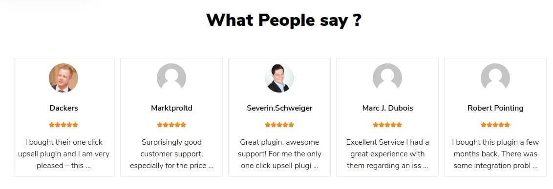
So, the above screenshot is from one of our product pages i.e WooCommerce One Click Upsell Funnel Pro. This is a WordPress plugin for enhancing the core features of WooCommerce. It helps the merchants for making post-purchase offers.
Along with our product copy, we have placed customer testimonials on our page to share the greatness of the plugin through some real stories. This showcases the trust between the customers and the brand just with the help of some candid and true experiences.
6. Showcase Your Social Proofs
After customer reviews, social proofs are something that can add to the trust-building of your product page. If your product has been endorsed with any reputable badge or seal, then why not display it proudly?
Social proofs can include any product characteristics or feature that is valuable to your customers. Just adding them to your web page is not enough. In the journey of eCommerce product page optimization, you have to take that they are portrayed distinctly.
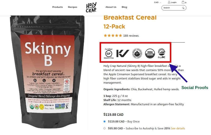
Now in the above example from Holy Crap, we can see they have highlighted some very specific and must-know specifications. It attracts the bottom-line concerns (e.g. if a customer is allergic to gluten and requires a gluten-free product) instantly.
Note: For badges like “USDA Organic” you need official permission and use the exact symbol or logo.
The demonstration of social proofs acts as an encouragement for online shoppers. It makes them realize that others have made a choice or partaken in a product or service of your brand – thereby motivating more people to do the same.
Online shoppers are very smart and looking for validations that can help them in making positive purchase decisions. Thus, social verification plays the role of evidence and conveys to the buyers the investment that they are willing to do is genuine. Not only product highlights but even customer testimonials from renowned reviewing sites can do the job perfectly.
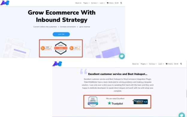
So as you can see above, we prominently display social proofs on our product pages and even the home page. Social proofs eulogize your business values and are a good supplement to the word of mouth recommendations.
7. Increase Average Order Value With Upsell And Cross-Sell
The main objective of a product page is to sell.
In order to achieve the sales targets, business owners cram their pages with too many offers that can make it a little overwhelming for the customer. If you follow this approach, then instead of getting sales you might end up losing them. Herein, comes an age-old marketing and selling technique – upsell and cross-sell.
Upselling and cross-selling are used by marketers for increasing the average order value, of course, moderation is the key. In eCommerce marketing, moderation is fundamental for upselling and cross-selling, going overboard can feel aggressive or being spammy. Moreover, too many offers can lead the consumer into a situation of analysis-paralysis. It may distract the buyer from completing the intended order.
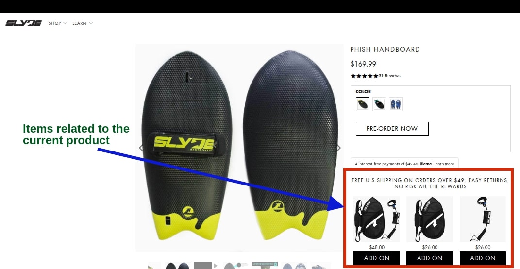
I came across Slyde and it turned out to be a perfect example that displays additional products (for cross-selling) without overcrowding their page. The thing is to be noticed that it has done so smartly that they offer products that are relevant to the current order in the purchase.
Now instead of offering additional products, you can increase the average order value by suggesting an upgrade of the current product. Let see another example from Amazon:
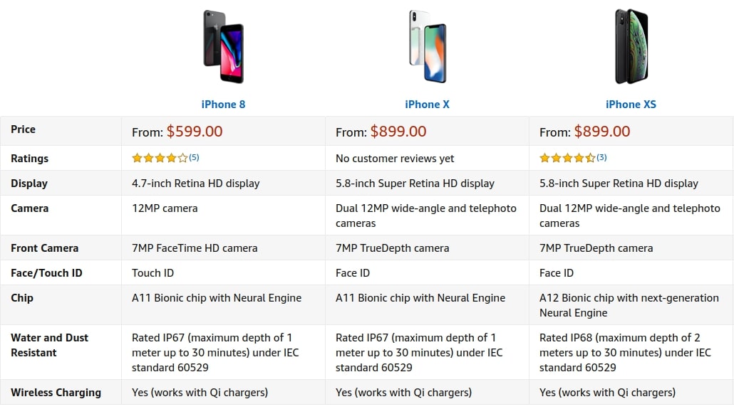
In the above example, I looked on Amazon to buy an iPhone. While scrolling down the product page, Amazon shows me a comparison table. This persuades me to buy an upgraded version of the current product. Thus, it says with suggest few more bucks, I can get a higher version of the iPhone.
Not just version upgrades but there are various other ways you can use upsell and cross-sell on your product page to increase average order value. I’m talking about offers like “Protect Your Product”, “Customize Your Product”, “Extended Services Period”, or even creating bundles of related products.
Product Pages Are The Lifeblood For Ecommerce Store
In an eCommerce website, the product pages are the lifeblood of your online store. These are the ones that are responsible for bringing sales for your business. If your eCommerce product pages are unstructured or poorly presented then, you’re inviting the risk of frustrating the customer.
Thinking out of the box for creating stand-out product pages might demand you to go the extra mile. But if you do so, it will work wonders for your business. An extra effort with some simple tweaks grabs the attention of interested shoppers for both your products and company.
If your goal is to create product pages that sell, then I will recommend then leave no stone unturned. Even the smallest change will leave a significant impact on your business.
In this blog, I tried to cover all the basic and simple tips for eCommerce product pages to improve sales. If you think there is more to it, then scribble your suggestions in the comment box now.
While designing your product page, you should target providing your customer with a seamless and enjoyable shopping experience. Let me end this with a quote by the legendary Jeff Bezos,
“We see our customers as invited guests to a party, and we are the hosts. It’s our job every day to make every important aspect of the customer experience a little bit better.”







thanks for giving such informative blog regarding the tips to improve e-commerce website to drive sales and promote online presence.
Absolutely amazing article! I really like the tips of Increasing the Average Order Value With Upsell And Cross-Sell. Thanks for sharing this enlightening article with us. Loved this post and I’m pinning it to share!
Thank you Priya, I’m glad to know that you found this article informative. I completely agree with you, upsell and cross-sell are two very powerful weapons that every online seller should have in their arsenal.