Have you ever noticed that if you happen to forget a company’s name, you will recognize it as soon as you see the logo? A logo is not just a symbol but a trademark that increases the recognition of a business. Today eCommerce business owners invest in logo design to make their brands stand out from the crowd and grab customer attention.
After the name of a brand, logos are that one thing that uniquely identifies a brand.
Logos also have a great impact on the web presence of an online business. They create consistency across the internet. Thus, it helps you to get identified by your target audience whenever searched online.
These small icons are not just an identity, they are the face of your brand. In the world of branding, logos add exoticness to your business blueprint.
The goal behind designing a logo for your online business is to:
- Make your brand look unique and recognizable.
- It makes your brand memorable for your target market.
- Make your business stand out from the competition.
The logo is not only for shaping your business into a brand but it is there to build trust and recognition among your target audience. Thus, we realize its importance and here we’re with a complete guide on:
How to create a unique and memorable logo for your online business?
In this article I’ll be covering:
Shall we begin?
What Does a Logo Mean for Your Business?
Did you know the human brain can process images 60,000x faster than words?

This fact alone tells us what a logo means for your business. Realizing the fact that designing a logo is an integral part of branding, 18% of business owners are ready to invest $1,000 for their company logo.

Successful brands know that a logo can embody them in their customers’ minds. They know that a logo is a medium with which they can bring an idea to life with a visual and communicate in a way that words can’t.
I agree that providing awesomesauce products and services should be the prime motive of any business. But you can think of a logo as a support system for gaining visibility, building trust, and goodwill amongst your target audience.
Here are some important reasons why brands invest heavily in designing a logo:
1. Logos grab attention

With so much competition around, the attention-seeking span of customers is getting shorter. In the world of information overload, you only have less than 3 seconds to stand out and grab the attention of a shopper.
Herein comes the role of a logo. It can quickly grab the viewers’ attention and communicate the core values of your products. If you have a solid logo to speak for your company, those 3 seconds are enough for grabbing the shoppers’ attention.
2. Lays the foundation of your brand identity

Although designing a logo is just a part of your branding blueprint, it lays the foundation of the entire brand story.
Successful branding is about telling a story that resonates with customers’ emotions and the logo plays an important role in doing so. Elements like colors, fonts, and tones determine the narration of your story whereas the stage is set by the logo.
3. Logos build an instant connection between a brand and audience

Logos are symbols that act to build an instant connection between a brand and an audience. Ideally, the purpose of a logo is to jog your customers’ memory about what your company does.
A visually aesthetic logo is responsible for triggering the positive recall about the brand that your company name alone might not be able to. In short, logos are a point of identification for your audience.
4. It makes you stand out from the crowd

Yes, there are hundreds of coffee shops in the town but yours is the only one that sells freshly brewed cups of caffeinated coffee. For attracting coffee drinkers to your business you need a logo that conveys your business’ message.
If you dare to stand out from the crowd, logos can definitely help you in telling your customers why your business is unique.
Through the right icon and tagline, you can convey the complete background and mission of your business to your target market.
5. Vital for brand loyalty
As consumers, we always crave for consistency.
As a business grows into a brand, your logo will become more familiar to a wider audience. And believe me, this familiarity ultimately paints an image of your brand being trustworthy in the consumers’ minds.
Let’s understand with an example.
Whenever I think of shopping for some activewear, either online or offline, I search for Nike. There’s a simple reason. As soon as I see the “swoosh” sign, I could relate to a brand in which I trust. The Nike swoosh sign is the consistency that I crave for when it comes to shopping for activewear.
So these were some points that define the importance of designing unique and memorable logos. I hope you’re now able to understand what a logo means for your business.
Let’s move on to the next part of this article. Now I’ll be giving you a complete walkthrough on how to design a unique and memorable logo for your online business.
Step-by-step Guide for Designing a Unique and Memorable Logo
Now we’ll see a basic step-by-step guide for designing a unique and memorable logo for your business. Either you hire a designing team or design a logo yourself, the process will involve the same step which are:
1. Start with developing a brand identity
Everything from the color to the combinations of various elements on the logo distinguishes your brand in the customers’ minds. Thus, while deciding the visual elements, keep the catch-all term in mind which is “Brand Identity”.
Firstly, find answers to the following questions:
- Why did you start your business?
- What are the values of your brand?
- What makes you different from your competition?
Once you’re able to find the answers to all the available questions, you’ll get a perfect idea of your brand identity. Finding your brand’s distinguishable features is very important before you start sketching the logo. It lets you know what you’ll be recognized for by your customers.
Wondering where to start?
Start by creating a mind-map for your brand’s unique selling proposition (USP). Mind-mapping is a great visual brainstorming technique. Start with a central idea (your brand name in this case) and then start connecting it to keywords and concepts around your central idea.

In the process of brand development, mind-mapping is a great way of finding a coherent brand identity.
2. Search for design inspiration
So this step officially marks the beginning of your design journey. But it’s not that easy. In the beginning, you will be startled by the number of ideas for your design inspiration. Having too many ideas can be very harmful to your creative endeavors.
When there’s an information overload, chances are you might end up in Analysis Paralysis, leading to the paralysis of the forward processes in your logo design.

Does that sound scary?
Don’t worry.
This is where your mind map will come into play. To avoid the analysis-paralysis situation, don’t think you’re on a task for building something from scratch. Instead, think that the logo already exists; you just have to put the elements together from the mind-map.
Using already established designing principles, you just have to put the pieces together with the design inspiration you’ve chosen.
If you don’t know where to search for your design inspiration, here are some sources that might help you:
-
Logoed
The site has a single-page that lets you scroll through a frequently updated collection of stunning logo ideas.
-
Logospire
It has a vast collection of user-submitted logo designs flowing with creative juices.
-
Brand New
Basically, it’s a blog that has designs and redesigns of some notable brands of all industries.
-
Logo Design Love
The unique thing about Logo Design Love is that graphic designer David Airey curates this blog that reviews marketing designs and logos.
You can also see help from social media platforms such as Instagram for finding awestruck design inspiration. The next time you scroll your Instagram feed, just look for posts with hashtags like:
- #logo
- #logogdesigns
- #logodesigner
- #graphicdesigning
3. Go with colors that reflect your brand

Colors are more than just visual stimuli. As per a study conducted by the Seoul International Color Expo, 92.6% of people said that visual factors play an important role in making buying decisions.
Note: “visual factors play an important role” and the color is one of those visual factors.
Logo colors will be used on your website, marketing emails, social media, and wherever your target audience interacts with your brand.
There’s nothing like that a specific color is universally “better” as each color speaks its own story. While choosing colors you have to decide what you want to convey.
Did you understand?
No?
Don’t worry; with the help of some examples, we’ll understand the psychological effects of various colors.
Brown
What comes to your mind when I say brown?
For me, the answer is coffee or chocolate. For you, it could be something which is natural and that’s what brown identifies.
With brown, an individual can relate to nature, homemade goods, or freshly baked treats. MadeGood uses the properties of color for conveying its brand message.

So you can see that MadeGood uses the brown heavily in their packaging and marketing to build a sense of earthiness and refresh the memories of homemade baking.
Orange
Orange as per me, means warmth, passion, and energy. It also invokes the idea of summers when paired with some lighter shades like light blue and soft green. Lumi is one such brand that is orange-focussed on its branding. Orange justifies its products that remind the shoppers of a refreshing treat in the hot summers.

We can go on discussing each color. Every shade can be related to an emotion or a thought like purple can be associated with luxury, blue evokes peace and comfort, while black, grey, and white relate to calmness, balance, and clarity.
Using Multiple Colors
So it is not a compulsion to use only a single shade in your brand’s logo. There are many brands that combine two or more shades to justify a specific goal.
Here’s an example:

Source: Logodix
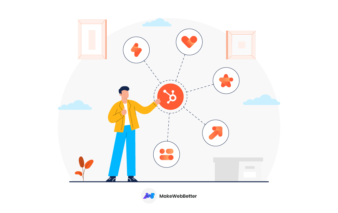
The typical logo can be found in purple and orange. However, the brand has developed various alternatives for defining specific departments.
It is highly recommended that you go with monochromatic designs, especially if you’re starting with a new venture.
This is due to the fact that a single color is easy to coordinate with. Moreover, it will be easy for you to design other graphic elements of your online store logo if you go with a monochromatic design.
Still, if you want to go for a multicolor logo design, take care of the color combination you’re going to use. The color theory is quite complicated but you consider some online tools like Canva for choosing a color scheme.
Canva’s color palette generator generates a color scheme either from an image or randomly. You can also search for color palettes using keywords.

Keep in mind that simplicity is the key. The more you can simplify your design, the better your logo would be. Also, it is very hard for customers to remember your brand logo if the design is too complex.
4. Select typeface and font
For enhancing the consistency in your design, you need to select a typeface. Your logo may not include text but a lot of your brand elements like web copy, much of the graphic design, signage will include some text. Thus, for the sake of continuity, it is important to select a typeface for your online brand logo, even if it is not being used in the logo itself.
Typeface v/s Fonts, What’s the difference?
The typeface and fonts are two words that are often confused and used interchangeably in most contexts. They’re not synonymous instead there’s a huge difference between the two. Before you go on selecting a typeface, you should be well aware of the distinction between a typeface and font.
The confusion between the two arose due to the naming convention of digital fonts in the operating systems, which refers to typefaces with fonts.

The typographical characters and symbols are known as the typeface whereas its segmentation into variants on the basis of weights, width, or style is called font. For example, Helvetica is a typeface and Regular, Bold, Oblique are the fonts.
Basic Styles And Their Usage
There are a plethora of typefaces and fonts to choose from. We’ve summed up the four basic styles for you paired with their optimal usage.
Typeface |
Fonts |
Usage & Characteristics |
| Serif type-style |
|
Serif type-style provides an attractive display. They can be found in print materials’ bodies like newspapers and magazines. Luxury brands that cater to a premium audience often use serif type-style. |
| Sans serif type-style |
|
If you’re looking for something that can be associated with modernity and yet it is minimalist and simple, then sans serif should be your choice. The best part about the sans serif fonts is that they are versatile. It is the best typeface for on-screen copies and headlines. Businesses that want to convey a sense of elegancy and simplicity through their brands can use sans serif type style. |
| Script type-style |
|
Script style is driven by the motivation of “humanizing” the text. Script typeface is basically a derivative of handwriting. Also, a great way of altering the feel of your online copy. The formal font is used by brands for giving off a feeling of luxury, passion, and romance. Whereas, the informal font is used for giving an unostentatious, and homespun vibe. |
| Decorative type-style |
|
So the decorative fonts can convey a wide variety of moods that generally revolve around a specific theme and aesthetic. The usage of decorative style can be tricky. Though they are aesthetically diverse but generally more difficult to read. Thus, using this typeface in your body copy is a bad idea. The usage of decorative fonts should be very minimalistic and pertain to one or two letters. |
So this was all about typefaces and fonts and its usage in logos. Just like color, a slight tweak in your fonts can bring a huge difference in what your brand wants to convey. Before choosing a typeface for your logo be completely aware of the guidelines about when to use.
Here’s a brief description of various typefaces and fonts:

5. Create different variants
Before coming to the final logo design, it is highly recommended to create several rough designs. The journey of designing a unique and memorable logo involves a lot of trial and error. There is a chance you might spend a whole afternoon with no idea to present at the end of the day.
Play with every color and script and create all the possible designs that go well with your brand persona. If nothing else, you’ll have enough data to narrow down your options and reduce your work each day.
Once you’ve created all the best possible variants of your logo, test them on your colleagues to find the most successful option.
6. Collecting feedback
Congratulations!! Now you have got a design that could be your potential brand logo, it’s time for testing your design on some real audience. Here comes the role of feedback. Feedbacks are really great for validating your design.
You can take feedback nearly from anyone that falls under your brand’s target demographic.
For effective feedback collection, here are some questions that you can ask from your audience:
- What’s the first thing that comes to your mind?
- How will you categorize my brand?
- What is that one thing about the logo that is memorable?
- Is there any element in the logo that is difficult to comprehend?
- What is that one thing in the logo you want to remove?
So, you have your feedback from your target audience and now it never underestimates the importance of your brand logo. With help of all this feedback, you can start polishing your design and start making the important changes.
With this, we come to the end of the step-by-step guide for designing a unique and memorable logo for your online business.
For business owners with a small marketing budget, it might be difficult to invest in expensive designing software.
I’ll be discussing some really cool logo designing platforms that are either very cheap or completely free of cost.
Shall we begin?
Design a Unique and Memorable Logo for Free (or Very Cheap)
Generally, when a company is in the startup phase, it is not very feasible to hire a freelancer or an agency for doing the job. To save the extra cost and instead of increasing the marketing budget, why not create a logo by yourself?
Here are some designing platforms that are really cheap or completely free of cost:
Canva

Canva is a very popular graphic design platform that features a drag and drop editor. It features an enormous collection of free logo design templates that can be customized as per choice very easily. Being a bit more accessible logo creator, Canva is a perfect choice for people with less design experience.
However, with so many logo templates, it might feel overwhelming in the beginning but you’ll get used to it eventually.
The limitless design collections of Canva gives you complete creative freedom.
LogoMakr

LogoMakr features a streamlined logo creation process that’s very user friendly for beginners. It offers an easy-to-arrange layering which is similar to the Layer tools in Photoshop and other such complex designing software. LogoMakr has a huge database of searchable graphics with an easy to operate text toolbar.
Ucraft

Ucraft along with a logo maker offers a complete website builder. If you have a time crunch and want a quick minimalistic logo design for your brand, Ucraft’s logo builder is a hands-on choice.
It lets choose from three different options that are:
- Text
- Icons
- Shapes
Also, similar to Canva, Ucraft’s logo maker has drag and drop functionality for adjusting your logo elements. Though the design options are limited, it’s simplicity makes it a great tool for designing a logo in the nick of time.
MarkMaker

Now MarkMaker is a logo generator that has very limited customization options. But being one of the easiest logo generators makes up for the customization limitations.
What makes it unique?
MarkMaker has an AI-powered graphic design robot that logos and refines them based on feedback submitted by you. As they say:
“Our system attempts to understand the visual vernacular associated with logos for different kinds of companies.”
Once you enter your feedback, you’ll witness an endless feed of instantly generated logo ideas.
So these were some logo creators that can help you in designing a unique and memorable logo for your online business. Every tool has its own pros and cons that are subjective. Thus, I’ll recommend you to each and every option from the list and go with the best option.
Adding to this, I would say that free logo generators come with certain limitations. Also, there are chances that your logo is similar to that of your competitors. In this era of cut-throat competition, as a full-time entrepreneur, you cannot afford the risk.
As a smart business owner, it is highly recommended to go with a professional designer for the job. A logo plays an important role in attracting the audience with creative expressions and only a professional can do justice.
Avoid These Common Design Mistakes
When you’re doing so much to build your brand, a single wrong step might put all your hard work in vain. From whatever we’ve discussed till now we can understand – never underestimate the importance of your brand logo.
While a logo is something that depends totally upon you and there’s nothing like right or wrong with creatives, but there are some common design mistakes that should be avoided. Let see the dos and don’ts of creating a logo:
Dos |
Don’ts |
|
Keep your color scheme simple. As I had mentioned earlier too, the monochromatic color scheme is highly adaptable. Keep the selection of your color scheme very simple. |
Avoid overcomplicating your design. Avoid packing too many colors in your design. For example, Apple’s logo is so simple and easy to be remembered by its audience. Compared to complex designs, simpler ones are far easier to convey your brand’s message. |
|
Design variations in different sizes and variations. Your brand logo is not just for your eCommerce website. It will be used on your social media handles and even your coffee mugs. Thus, it is highly advised to plan ahead for different size options. |
Don’t create dissimilar variations. While creating variations avoid too many rearrangements of the design elements. |
|
Analyze your competitors. There are successful examples in every industry vertical. You can take your inspirations from these successful brands. |
Don’t replicate. Take inspiration from these brands but don’t imitate them. It’ll not only fall under plagiarism but also, make it difficult for your brand to stand out. |
Over to you…
So we see designing a logo has a huge impact on making your brand unique and memorable. Creating a symbol that will be the face of your business is not that easy. The process needs time and resources to make your online business stand out from the competition. It doesn’t matter whether you’re a business with large or small marketing, you cannot sacrifice your brand logo at any cost.
With so much information and guidelines available online, the idea of designing a logo may look daunting at first. But with a stronger understanding of basic design principles, you can create a winning band logo.
I would like to end the article with a quote because someone else has already said it best:
“A logo doesn’t sell (directly), it identifies.”
—Paul Rand




Hey dude, what a great blog. I have never read an idea like that. I love it so much. Carry on dude and make posts like that for your audience.
I’m glad that you loved this blog post. Thank you for showering your love in the comment section.